Quantcast
Channel: Blogs - Web
Viewing all 380 articles
Browse latest View live

Binding Kendo UI Chart and Editable Kendo UI Grid to the Same Data

$
0
0

In this tutorial, learn how to populate a Kendo UI Chart with data bound to a Kendo UI Grid, and add new capabilities to your apps.

Combining some of the most used widgets from the Kendo UI suite is a common requirement, and the possible integrations and requirements are endless. Maybe it's rendering a Kendo UI Chart within a cell of each row for displaying a collection from the data item; populating external Chart with the data from the selected row in the Grid or from the grouped data, using the aggregates for a specific field; creating multiple series from each data item or from different columns.

As technical support officers, we are often challenged with real-life scenarios for integrating multiple widgets from the Kendo UI suite. There are always some great ideas coming from the developers using the widgets in ways that none of us considered as a use-case (like using the selected/hovered series in the Chart for filtering the Grid). Like everything else in the developers’ world, there is no product that could do everything out-of-the-box, and with every new client there is a new requirement that will require customization. This applies for integrating Chart with Grid as well.

Visualizing Grid Data in Chart

In this blog post I will focus on two different use-cases for visualizing Grid data in the Kendo UI Chart:

  1. Creating series from every data item on the current page
  2. Populating the Chart from grouped data in the Grid, using the group aggregates

It should be mentioned that due to the difference in how both widgets are handling the data, it is highly recommended to create the Chart dynamically, based on the Grid data and the requirement, and to always re-initialize the Chart when needed (by using its setOptions method). This approach gives us the freedom and flexibility to easily manipulate and configure the data.

Now, let's start with the implementation. For both examples, we will be using the following starting point:

<!DOCTYPE html>
<html>
<head>
    <style>html { font-size: 14px; font-family: Arial, Helvetica, sans-serif; }</style>
    <title></title>
</head>
<body>
 
  <divid="example">
      <divid="grid"></div>
      <divid="chart"></div>
  </div>
  <script>
    //TODO
  </script>
</body>
</html>


Chart Series from Data Items in Editable Grid

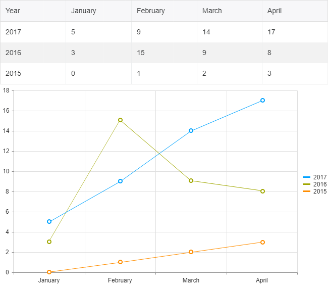
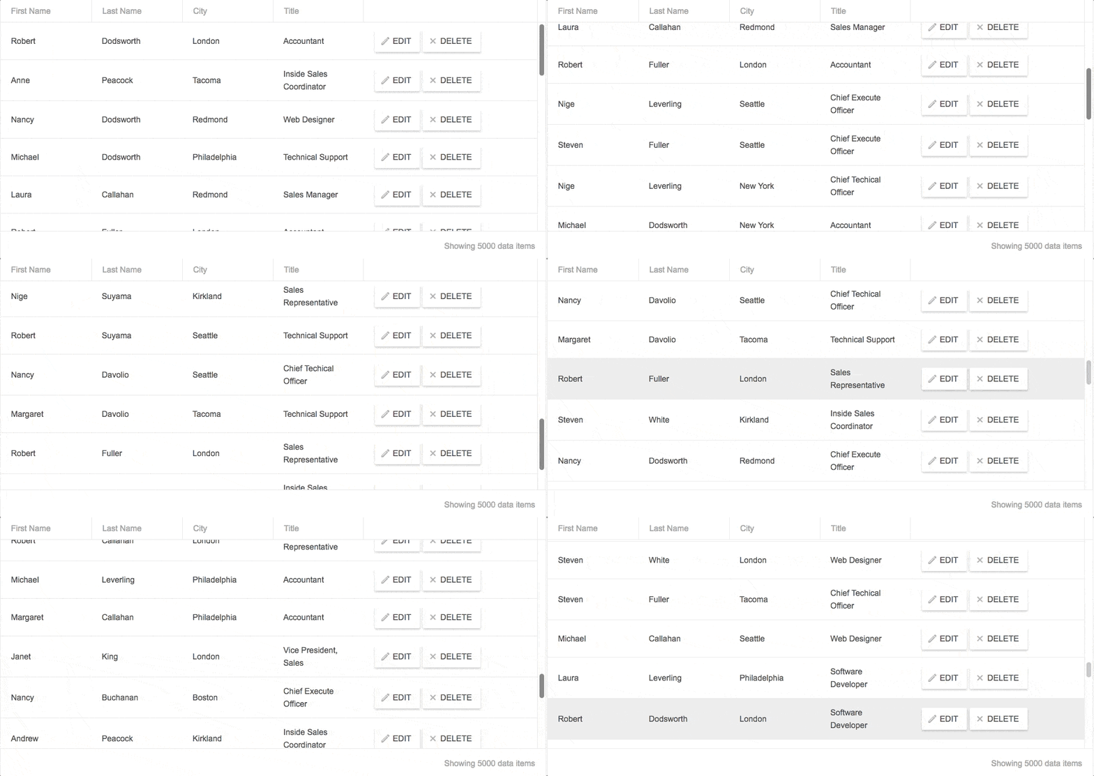
Grid and Chart with same data

Imagine that we have the following data structure:

{year: 2017, January: 5, February: 9, …},
{year: 2016, January: 3, February: 15, …}

Such data could be easily visualized in Kendo UI Line Chart, where the series will be created for each year and the months will be used for categories. 

Once we know which field from the data items will be used in the series of the Chart, we can initialize the widgets. We will be using dummy data for the example and the records will contain information for a few months only (for brevity):

<script>
    //We will be using a few months for brevity
    var months = ["January", "February", "March", "April"];
    $("#chart").kendoChart({
      seriesDefaults: {
          type: "line"
      },
      categoryAxis: {
          categories: months, //Each month(column) is added as a category
      }
    });
     
    //Initializing the Grid
    $("#grid").kendoGrid({
      dataSource: {
        data: getDummyData(),
        schema:{
          model:{
            id: "Year",
            fields: {
              "Year" :{ editable: false},
              "January" :{ type: "number"},
              "February" :{ type: "number"},
              "March" :{ type: "number"},
              "April" :{ type: "number"}
            }
          }
        }
      },
      editable: true
    })
     
    function getDummyData(){           
      var data = [
        {Year: 2017, January: 5, February: 9, March: 14, April: 17},
        {Year: 2016, January: 3, February: 15, March: 9, April: 8},
        {Year: 2015, January: 0, February: 1, March: 2, April: 3}
            ];
       
      return data;
    }
</script>

The above will render and populate the Grid with the data, but the Chart will be empty. Since our Grid will be editable, we need to ensure that the Chart will be updated after each change in the dataSource. The perfect event for updating the Chart data in this way is the “change” event of the dataSource:

$("#grid").kendoGrid({
      dataSource: {
        change: function(e){
          //The Chart will be updated on each change of the DataSource
          updateChart(e.sender);
        },

And here is where the magic begins. Within the updateChart function, where we'll update the Chart, we will retrieve each dataItem from the current view of the Grid's dataSource and we will create all series based on the updated data. The series will contain a data collection with the values from each month, and the Chart will use the “categories” from the “categoryAxis” array to match the values accordingly. When we create the new series with the new data, we can modify the options of the Chart and call its setOptions method for re-initializing the widget:

function updateChart(dataSource){
  var dataItems = dataSource.view();
    var chartSeries = [];
    var chartData = [];
     
    dataItems.forEach(function(item){         
      var data = [];
      months.forEach(function(month){
        //Each month's value is added to the data collection
        data.push(item[month]);
      })         
       
      chartSeries.push({
        data: data,
        //we will be using the Year from the dataItem as the name
        name: item.Year
        })
    })
   
    var chart = $("#chart").data("kendoChart");
    var options = chart.options;
    options.series = chartSeries; //setting the series with the new data to the options
    chart.setOptions(options); //re-initializing the Chart
}

Try Out the Code

The entire code of the example can be tested in the following dojo:

Chart Series from Grouped Grid Data

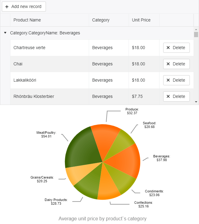
Grid and Chart with the same data

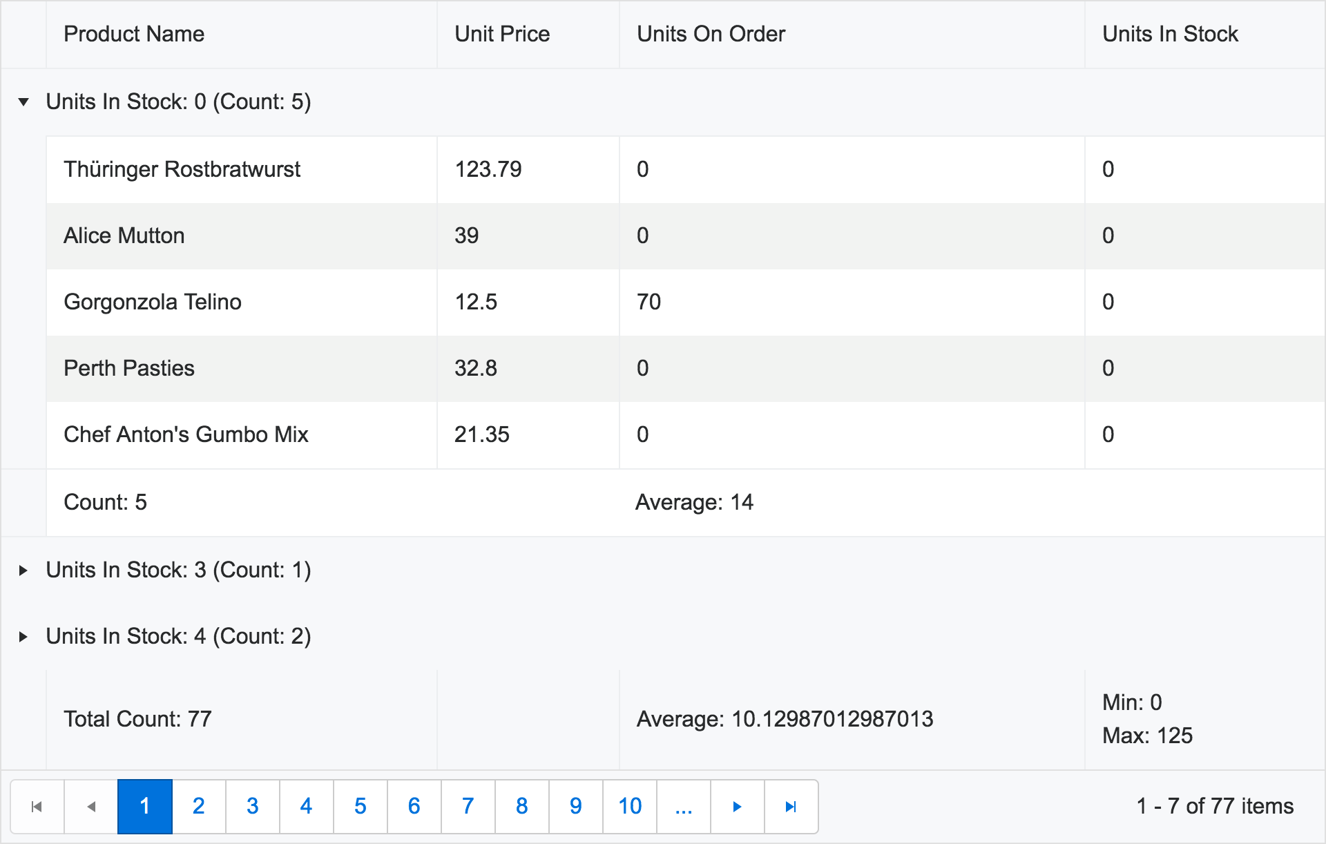
For this example, we will bind the Grid to products collection and will group the data by the product's category. We will configure the average aggregate for the unit price and will have an average for each category as a result. The grouped data and the aggregates will then be used to populate a Pie Chart.

Due to the custom editor for the Category field and the aggregates, the configuration of the Grid will be fairly complex:

<!DOCTYPE html>
<html>
<head>
    <style>html { font-size: 14px; font-family: Arial, Helvetica, sans-serif; }</style>
    <title></title>


</head>
<body>
        <scriptsrc="../content/shared/js/products.js"></script>
        <divid="example">
            <divid="grid"></div>
            <divid="chart"></div>
 
            <script>
 
                $(document).ready(function () {
                    var dataSource = new kendo.data.DataSource({
                       pageSize: 20,
                       data: products,
                       autoSync: true,
                      group: [
                        {field: "Category.CategoryName", aggregates: [
                             { field: "UnitPrice", aggregate: "average"}
                          ]}
                      ],
                      aggregates:[
                        { field: "UnitPrice", aggregate: "average" }
                      ],
                       schema: {
                           model: {
                             id: "ProductID",
                             fields: {
                                ProductID: { editable: false, nullable: true },
                                ProductName: { validation: { required: true } },
                                Category: { defaultValue: { CategoryID: 1, CategoryName: "Beverages"} },
                                UnitPrice: { type: "number", validation: { required: true, min: 1} }
                             }
                           }
                       }
                    });
 
                    $("#grid").kendoGrid({
                        dataSource: dataSource,
                        pageable: true,
                        height: 550,
                        toolbar: ["create"],
                        columns: [
                            { field:"ProductName",title:"Product Name" },
                            { field: "Category", title: "Category", width: "180px", editor: categoryDropDownEditor, template: "#=Category.CategoryName#"},
                            { field: "UnitPrice", title:"Unit Price", format: "{0:c}", width: "130px",groupFooterTemplate: "Average #=kendo.toString(average, 'n2')#", aggregates: ["average"] },
                            { command: "destroy", title: " ", width: "150px" }],
                        editable: true
                    });
                });
 
                function categoryDropDownEditor(container, options) {
                    $('<inputrequired name="' + options.field + '"/>')
                        .appendTo(container)
                        .kendoDropDownList({
                            autoBind: false,
                            dataTextField: "CategoryName",
                            dataValueField: "CategoryID",
                            dataSource: {
                                type: "odata",
                                transport: {
                                    read: "https://demos.telerik.com/kendo-ui/service/Northwind.svc/Categories"
                                }
                            }
                        });
                }
 
            </script>
        </div>
</body>
</html>

For the initial configuration of the Chart we'll set only the known variables, and leave the series data to be populated after the groups of the Grid are created:

$("#chart").kendoChart({
                        title: {
                            position: "bottom",
                            text: "Average unit price by product's category"
                        },
                        legend: {
                            visible: false
                        },
                        chartArea: {
                            background: ""
                        },
                        seriesDefaults: {
                            labels: {
                                visible: true,
                                background: "transparent",
                                template: "#= category #: \n $#= value#"
                            }
                        },
                        series: [{
                            type: "pie",
                            startAngle: 150
                        }],
                        tooltip: {
                            visible: true,
                            format: "${0}"
                        }
                    });

Once again, as in the first example, we will update the Chart within the “change” event of the dataSource:

var dataSource = new kendo.data.DataSource({
  change: function(e){
    updateChart(e.sender);
  },

And here is how we populate the data for the series by using the group value (the CategoryName of the group) and the average aggregate as a value:

function updateChart(dataSource){
   var dataItems = dataSource.view();                                        var data = [];
   dataItems.forEach(function(group){        
     var aggregateValue = group.aggregates["UnitPrice"].average.toFixed(2);
     data.push({category: group.value, value: aggregateValue});  
   })
 
   var chart = $("#chart").data("kendoChart");
   var options = chart.options;
   options.series[0].data = data;
   chart.setOptions(options); //re-initializing the Chart
}

Try Out the Code

The entire code of the example can be tested in the following dojo:

Endless Possibilities 

With a good understanding of the Grid and Chart widgets (or with a little help from our technical support officers team), you can enhance your apps in a number of ways by using the data from the Grid and visualizing it in the Chart. We'd note though that it is important to understand the data structure as well in order to create the series correctly. 

Try out the examples in the dojos above and let us know what you think. Happy coding!


Dynamic Data in the Kendo UI Grid

$
0
0

Learn how to create Kendo UI grids with dynamic data in this step by step recipe.

The moment you find yourself typing the same code over and over again, you know that something is off. You know that the code you are writing is getting WET (Write Everything Twice or We Enjoy Typing).

You need to stop, plan, modularize and DRY it off. You will thank yourself later when the next grid is up in seconds and you are sipping on that cup of coffee you have been thinking of all afternoon.

Creating editable Kendo UIGrids with dynamic data is like cooking an a-la-carte meal the easy way. As a Technical Support Engineer at Progress, I have seen plenty of our clients' "kitchens," helped resolve questions and given advice regarding dynamic data—and I am here to give you the recipe.

The Dynamic Data RecipeKendo UI Chef
Ready in about 1 hour
Medium level skills
Serves: 1 editable and 1 non-editable grid


Ingredients

1. Consistent Backend Service and API
2. One initial ajax request
3. Client Grid Configuration
4. Client Data Source Configuration

Method

1. Create a backend with consistent naming of the controller actions. For example:

  • READ
    http://domain/Orders
           http://domain/Customers       
  • CREATE
    http://domain/Orders/Create
      http://domain/Cutomers/Create  
  • UPDATE
    http://domain/Orders/Update
    http://domain/Customers/Update
  • DELETE
    http://domain/Orders/Destroy
    http://domain/Customers/Destroy

2. (This step applies to a read-only grid—for an editable grid, go to step 3.) Naturally, a read-only grid requires less complex logic. I created a simple function, called in the success handler of the initial ajax request. It adds some common options and its data source needs only the read operation.

    // add the grid options here 
    function populateGrid(response) {
        var columns = generateColumns(response);
        var gridOptions = {
          dataSource: {
            transport:{
              read:  function(options){
                options.success(response);
              }
            },
            pageSize: 10,
            page: 1
          },
          columns: columns,
          pageable: true,
          height:300
        };

        // reuse the same grid, swapping its options as needed
        var grid = $("#grid").data("kendoGrid");
        if(grid){
          grid.setOptions(gridOptions);
        } else {
          $("#grid").kendoGrid(gridOptions);
        } 
      }
  
Since I do not want the "ID" column to take up much space, I created another the generateColumns function so I can alter the columns configuration. You can customize all the columns properties at this point.
  function generateColumns(response){
        var columnNames = Object.keys(response[0]);
        return columnNames.map(function(name){
          var isIdColumn = name.indexOf("ID") > -1 || name.indexOf("Id") > -1;
          return { 
            field: name,
            width: isIdColumn ? 50 : 180,
            title: isIdColumn ? "Id" : name
          };
        })
      }

Voilà! The read-only Kendo UI Grids with dynamic data are ready to be thrown in the oven. To show you how easy it is to use the functions above, I added a Kendo UI ToolBar with three buttons. When each button is pressed, the click function populates the respective Kendo UI Grid.

To open as an editable Dojo, hover over the right hand top corner     ⬎ 

3. To create a dynamic editable Kendo UI Grid, we need to create the dataSource schema model before the dataSource. In the success callback of the initial ajax request, pass a sample dataItem to the generateModel function. The function accomplishes two very important tasks:

Checks the type of each property so the grid can initialize the correct editor. For example, the number type will create a Kendo UI NumericTextBox, the date type will be equipped with a Kendo UI DatePicker when in edit mode.
Finds the unique schema model id and makes it non-editable. The unique id is a prerequisite for the editing functionality.

The function can be extended to include other schema model settings such as validation and default value. Or you may collect the field names of date types, so they can be formatted in the column settings later on.

 
      var dateFields = [];
      
      function generateModel(sampleDataItem) {
        var model = {};
        var fields = {};
        for (var property in sampleDataItem) {
          if (property.indexOf("ID") !== -1) {
            model["id"] = property;
          }

          var propType = typeof sampleDataItem[property];
          if (propType === "number") {
            fields[property] = {
              type: "number"
            };
            if(model.id === property){
              fields[property].editable = false;
            }
          } else if (propType === "boolean") {
            fields[property] = {
              type: "boolean"
            };
          } else if (propType === "string") {
            var parsedDate = kendo.parseDate(sampleDataItem[property]);
            if (parsedDate) {
              fields[property] = {
                type: "date"
              };
              dateFields[property] = true;
            }
          }
        }

        model.fields = fields;

        return model;
      }
    

4. Now that we have the schema model, we can create the Kendo UI Data Source. The function should receive the base URL and the model as parameters. Since the services follow a naming convention, it is easy to create this dynamic data source with CRUD operations:

      
    function generateDataSource(baseURL, model) {
         var dataSource = {
          transport: {
            read: {
              url: baseURL
            },
            create:{
              url: baseURL + "Create"
            },
            update:{
              url: baseURL + "Update"
            },
            destroy:{
              url: baseURL + "Destroy"
            },
            parameterMap: function(options, operation) {
              if (operation !== "read" && options.models) {
                return {models: kendo.stringify(options.models)};
              }
            }
          },
          batch:true,
          schema: {
            model:model
          },
          pageSize: 10
        };

        return dataSource;
      }


5. Next in line are the grid columns. Use this function to customize the formatting, width or other columns settings

      
      function generateColumns(sampleDataItem) {
        var columnNames = Object.keys(sampleDataItem);
        return columnNames.map(function(name) {
          var isIdField = name.indexOf("ID") !== -1;
          return {
            field: name,
            width: (isIdField ? 40 : 200),
            title: (isIdField ? "Id" : name)
          };
        });
      }


6. This is the final step. The schema, data source and columns are known and we can initialize the dynamic Kendo UI Grid. In my function, I am passing the id of the element from which I will initialize the grid but you can extend the createGrid function and append the newly generated grid elsewhere.

      
      function createGrid(gridName, baseUrl) {
        $.ajax({
          url: baseUrl,
          success: function(response) {
            var sampleDataItem = response[0];
            var model = generateModel(sampleDataItem);
            var dataSource = generateDataSource(baseUrl, model, editable);
            var columns = generateColumns(sampleDataItem);
            var gridOptions = {
              toolbar: ["create", "save", "cancel"],
              dataSource: dataSource,
              columns: columns,
              pageable: true,
              editable: editable,
              height: 450
            };

            columns.push({ command: "destroy", title: " ", width: 170 });

            $("#" + gridName).kendoGrid(gridOptions);
          }
        });
      }
    
The result—initialization of a dynamic editable grid with a single line of code:

<div id="products"></div>
    <script>
      createGrid("products", "https://demos.telerik.com/kendo-ui/service/products/");</script>

To open as an editable Dojo, hover over the right hand top corner    

This is just a basic dynamic data in the Kendo UI Grid recipe. There is much more than that which can be done, extended and plugged in as required. The examples I created here can be reused, saving you time and effort. The investment that one needs to make is well worth the payback when many similar grids need to be created—a naming convention, an extra single ajax request and coding a more abstract backbone logic so it can be reused.

If you already have your own Kendo UI Grid with dynamic data, please share what you do differently in the comments section below.

Kendo UI Support for React & Vue Webinars

$
0
0

We're excited to bring React and Vue support to Kendo UI. Learn everything you need to know and watch as we showcase the components in our upcoming webinars.

We are very excited to announce that our Kendo UI component library will now have support for React and Vue applications! This includes awesome UI components like our Date Picker, PanelBar, TabStrip, Grid and more. You can check out the whole list here:

As always, our components give you the ability to code more robust apps faster!

Now with one Kendo UI license you can have the support for Angular, jQuery, React and Vue. So, if you change or migrate to a new technology environment, you're covered. Along with the many resources we provide, like great demos and the super handy Theme Builder, with these libraries you also get several different support options. When giving you the tools to build great with we want you to also have support you can count on.

Come Check it Out!

We can only fit so much in a blog post, so we decided to put on a webinar for you! Join us and we'll walk you through the easy setup and showcase a few awesome things the components can help you build. If you have any questions message us on Twitter at @KendoUI or with the hashtag #heyKendoUI and we can try to get them answered during the webinar.

Webinar Dates & Times

We're really excited to bring you more support for your favorite frameworks! Hope to see you there and in the meantime, get a free trial and try them out now:

Thanks & Happy Coding! ‍

Telerik UI R3 2017 Release Webinar Wrap-Up

$
0
0

Join us for a recap of the latest release of our Telerik UI tools, updated and upgraded to help you develop better apps faster.

Earlier this week, Ed Charbeneau, Sam Basu, and I hosted the R3 2017 release webinar for our Telerik UI tools. We featured everything new in our latest release for Telerik UI for ASP.NET MVC, Telerik UI for Xamarin, Telerik UI for WPF, and many more. This blog post provides an overview of the webinar, a recording (in case you missed it), and a summary of the questions (with answers) that were posed during the webinar through #HeyTelerik on Twitter.

Webinar Recording

Don’t worry if you didn’t get a chance to watch the webinar. We’ve posted it to YouTube. You can watch it now.

Webinar Prize Winners

What would be a webinar without some cool prizes? Here are the winners of this webinar for asking great questions:

  • Koti Vuppalapati
  • Igor Soyfer
  • Shawn Hosp
  • Jennifer Bartolome
  • Peter Geiter

Congratulations! You’ve won a Holy Stone F181 RC Quadcopter Drone!

Questions and Answers

We received a wide range of questions during the webinar. Here’s a few of them that we had an opportunity to answer.

Kendo UI for jQuery

Are there plans to include the Material Theme in the jQuery version of Kendo UI?
A Material theme is available Kendo UI for jQuery, Kendo UI for Angular, Telerik UI for ASP.NET MVC, and Telerik UI for ASP.NET Core. This theme is a SCSS-based theme for the Kendo UI components which is based on the Material design guidelines.

What is the best way to get trained on Kendo UI and others and leverage the great potential of the product?
We offer training, here’s where you can read more: Kendo UI Training.

Telerik UI for ASP.NET MVC

When will this release appear on your private NuGet server?
Our release is available now.

Why RadVirtualGrid doesn’t include built-in filter/sorting like RadGridView?
I would take a look at our virtualization demo with the RadGrid. If that won’t help you achieve what your looking for, please let us know: Feedback & Feature Requests.

Does the new infinite scrolling grid load data periodically similar to the “News Feed” on most social media platforms?
Yes, that’s the idea!

Are these grids updates available only on Kendo UI, or are comparable updates available in the Grid for ASP.NET AJAX for .NET?
They should be pretty close to feature-parity. Since the RadGrid is older, it often has existing features that are “new” to the Grid widget in Kendo UI for jQuery. That stated, we improved accessbility with the RadGrid in the R3 2017 release; we now offer WAI-ARIA support validated by WAVE.

Looking at the new grid, I notice that when clicking delete we still get a standard confirm alert. Will it ever be possible to plug in our own confirm box?
You should be able to use PreventDefault and implement your own dialog. There’s an example in our docs: Customize Confirmation Window.

When using Virtual Scrolling at what point is the Read action executed? Only at the beginning? Or, at page breaks? How much and when is the data sent from the controller to browser?
When the page loads, Read() is called. Upon reaching the end of the page, Read() is called. The page length can be adjusted via property.

For operations with the Grid, what client-side security is possible to prevent attacks?
First, never trust the client. And second, always validate on the server before committing any operations against data. The good news is that you can perform this validation quite easily with Telerik UI for ASP.NET MVC since you can control the what happens on the server side.

Is it easier for searching data with the Grid instead of having to tweak the control in order to perform a search after pressing the enter key?
We have several ways to filter the grid. One type allows the enter key to submit the filter. Filtering is one of the Grid’s best features. We’ve made it highly-customizable so you can build the kind of user experience you need.

Can a grid cell be edited like a Spreadsheet? For example, to automatically move the cursor to the next cell when enter key is pressed.
We have many inline and batch editing capabilities. We also added new keyboard shortcuts to Kendo UI for jQuery and Telerik UI for ASP.NET MVC for this latest release.

Can you add Drag & Drop controls to Telerik UI for ASP.NET MVC?
We have Drag & Drop functionality built into many of our controls. It’s supported through Kendo UI, which is the client-side library used by Telerik UI for ASP.NET MVC. Further details about the Keyboard, Section 508 and WAI-ARIA support of Telerik UI for ASP.NET MVC extensions can be found in the Accessibility Overview section of the documentation.

Does the Scheduler support CRON inputs?
No. The recurrence rule string for events in the Scheduler follows the RRULE format as outlined in the iCalendar specification (RFC 5545). You’d need a cron parser and converter in order to get this working with the Scheduler.

With Virtual Scrolling and Endless Scrolling, how does the Excel export work?
Great question. Virtual scrolling and endless scrolling operate in similar ways in that they load data on-demand. This means that the Grid will typically have only a subset of the entire underlying data source loaded in its view. When the user exports this data to Excel, only the data contained in the current view will be exported.

Telerik UI for Xamarin

For the busy indicator, what is the default timeout? If we have more data, will it spin until it’s done loading?
The Busy Indicator has a simple IsBusy property that you can turn it on/off programmatically as needed.

Is there anything planned like the Scheduler or the Gantt chart for Telerik UI for Xamarin?
We are talking about it. Please drop us a line: Feedback & Feature Requests. We’ll update the roadmap for Telerik UI for Xamarin very soon.

What packages and/or products do I need from Telerik to use the Xamarin tools?
I’d start with Telerik UI for Xamarin and learning resources from Microsoft such as Xamarin University.

Are you going to support bottom navigation (tabs) for Xamarin Android?
The RadTabView allows developers to create user interfaces similar to the Android tab view (view pager and app bar combo) that can be positioned on all four sides of the parent view (typically of the main view).

If using Xamarin forms, do Windows apps compile to UWP to work on xbox, desktop, and mobile?
Yes. Xamarin.Forms has full UWP support and Telerik UI for Xamarin can light up your apps everywhere.

Is there performance hit using paths in Xamarin vs doing the drawing natively?
It’s minimal. We’re using Skia. Drawing native isn’t for the faint-hearted.

Why is Grid showing as a CTP?
We have many grids, each written ground-up. The one in Telerik UI for Xamarin is new and customized for cross-platform mobile. Hence, the CTP. It should be final soon.

When do you expect the DataGrid in Telerik UI for Xamarin to be fully-released?
Soon. We’ll likely do a couple of updates before final release. ETA R1 2018.

Telerik UI for UWP

How does UWP OSS work? Surely if all source is available then developers could do anything without a proper license?
It is completely free & OSS under MIT licensing. We do offer support. Sharing the love :)

With the recent news about Windows Mobile, is it worth writing UWP apps that target mobile?
I would suggest using Xamarin and Telerik UI for Xamarin if you’re looking to build mobile applications. That stated, UWP and Telerik UI for UWP helps you to build applications that run on all types of Windows-based devices. This includes the Xbox, HoloLens, IoT, and more.

Do you have anything with ink on Windows 10?
We had a demo with our UWP grid at Microsoft Build earlier this year showing how to use ink. Here is the moment from the keynote address where the Grid control was demonstrated with ink support:

Is there something for holographic apps? I know, it’s basicly like a UWP or Xamarin app, but maybe you got something more.
Telerik UI for UWP is open source and works in applications built for HoloLens.

Telerik UI for WPF

When should I use GridView vs (new) VirtualGrid for WPF? Is the GridView going to be replaced in the future with the VirtualGrid?
These controls are similar but they serve two very different purposes. The GridView displays data in a tabular format and supports many operations against this data. It’s ideal for displaying small-to-large sets of data. The VirtualGrid—on the other hand—is best suited for displaying massive data sets with a minimal in-memory footprint. The GridView is here to stay. It’s packed with features and is one of our most popular controls.

Telerik Reporting

We use Telerik Reporting in a WebForms application. Our large reports that have included controls (icons) fail to render. Is there a solution?
This sounds like you have a broken resource somewhere in your application. I’d recommend firing up your browser’s developer tools or Telerik Fiddler. Look for HTTP 404s (File Not Found) occurring for requests in stylesheets or for images. If any 404s are present then you need to resolve them.

What improvements have you made to the Standalone Report Designer in R3?
You’ll find a summary of the improvements we’ve made in the R3 2017 release: Telerik Reporting – Release History.

Did you think about a R interface or integration for your charts?
Nice suggestion! Please drop us a line and let us know what you’d like to see: Feedback & Feature Requests.

Kendo UI DevChat Recap: Responsive Dashboards with Angular and Bootstrap 4

$
0
0

This week on our "Kendo UI DevChat" series on web development, we built dashboards with Angular and Bootstrap 4. If you missed it, check out the replay as we answer questions we couldn't get to live.

The fun never ends with the Kendo UI DevChat webinar series! This time we covered how to build responsive dashboards with Angular and Bootstrap 4. The session was jam-packed with content and we had a very active group of attendees! As promised during the webinar I wanted to follow-up with the recording, sample project, some helpful links, and of course an extended Q&A section!

Webinar Recording

If you were unable to join in or if you want to watch the webinar for a second, third, fourth, maybe or even fifth time () then you can find the recording on our YouTube channel.

You can also find the completed GitHub project right here.

Additional Resources

As mentioned I wanted to add in a few resources for everyone to read to understand more about the changes in Bootstrap for v4. Here's a quick list that should help you get up to speed pretty quickly.

Questions and Answers

Throughout the webinar we had quite a few questions come through about Bootstrap, Angular, and Kendo UI! So, I tried to organize the questions below to have them be grouped together a bit logically.

Isn't Bootstrap v4 still in alpha? How safe is it to use it in production-type projects?
Actually, as of the day after this webinar the beta of Bootstrap v4 was released! So, the team keeps on trucking with releasing new versions. Yes, Bootstrap v4 was in alpha 6 during the webinar, but with the recent switch to beta we are getting closer and closer to the actual release. According to this issue on Bootstrap's GitHub repo the team has stopped work on Bootstrap v3 in order to get Bootstrap v4 out there and this beta release continues the march towards the initial release.

Would it make sense to organise widgets/components in a subfolder of the "app" folder, or is there a preferred folder structure you've worked with?
For the sake of brevity during the webinar I was just adding in components and widgets in to the app folder, but making sub-folders are definitely a good idea. I recommend looking at the official Angular styleguide for help on how to structure applications.

What is the unit of width? Is it number of pixel?
The main CSS unit has switched from px (used in v3 and lower) to rem. So, whenever we talk about a unit of measurement we are referring to rem. If you're interested in what rem is versus em, something you may be more familiar with, then I recommend reading this blog post. Also, for more information on what is new you can refer to the Bootstrap v4 migration guide.

What is "my-3" that you add on your classes?
So, with Bootstrap the team has set up some spacing utilities that one can use on any Bootstrap element (and it should work with other elements as well). This documentation section goes into more detail, but what "my-3" specifically does is apply a margin (hence the "m") on the y-axis (adding in "y") and we're using "3" here which is tied to the $spacer variable (not "3 units" as I mentioned in the webinar - my bad!).

Is Bootstrap v4 backward compatible?
While there are many familiar aspects of Bootstrap v4 compared to other versions, due to this being a major rewrite of the project I wouldn't call it a safe backwards compatibility. There are things like browser support (IE10+ and iOS 7+ for Bootstrap v4) and other items that add to this as well, not just new conventions. So, for now I would treat this as something that needs migration and rework in your projects. Luckily this Migrating to v4 document is helpful and continues to be updated to help with this process.

Is there a built in support for breadcrumb nav?
Yes indeed! This Bootstrap component called "Breadcrumb" should help with this requirement. You may need some more advanced routing set up in Angular, but the same idea of using routerLinks and routerLinkActive should work with this component as well.

What is the main advantage to migrate from Bootstrap 3.x.x to Bootstrap v4?
I discussed this a bit during the webinar as well, but overall I think the main advantage of upgrading to Bootstrap v4 is to keep up with the latest and greatest. Under the hood you have things like dropping support for older browsers (read: getting rid of superfluous code) and using newer CSS features (generally performance and productivity enhancers), but also streamlining features like the new Card (replacing many components from Boostrap v3). You also get to start using Sass rather than Less, which is where the CSS community is trending.

Could you show the Kendo UI Charts integraded as widget?
You're in luck! The GitHub project actually has a chart added, I just didn't have time during the webinar. Download it and try it out!

Is media attribute for the Grid available with the Kendo UI Default theme?
Yes indeed it is! However, when you're not working with the Bootstrap theme (which I was using in the webinar) you have to work with the matchMedia browser API like we do in this sample. The benefit of working with our Bootstrap theme is that you can use the breakpoint conventions from Bootstrap. The good news is that if you don't want to stick with the same set of colors as we offer out-of-the-box you can use our Sass Theme Builder to customize the Bootstrap theme colors with ease!

Is Kendo UI using only Bootstrap's CSS rules or does it carry its own?
With the Bootstrap theme we tend to use Bootstrap's CSS rules, but of course one can tweak and customize this from both a Bootstrap and Kendo UI point of view. If you're using the Default theme then you could also work with the matchMedia setting like I mentioned above.

Why do you set height like [height]="410" instead of height="410"?
So, setting the height like height="410" will work just fine as well. However, when you start doing down routes like binding this to an object or anything but a static height like this you'll have to start using [height]="x", so I tend to just stay on the safe side and work with the brackets here.

Is there a "fluid" component that will allow the grid to resize vertically as the windows resizes vertically?

This is a bit trickier than dealing with the width. While I do not have a great sample of this using Angular, we do touch upon the topic and how it can be addressed in this documentation article for the jQuery and AngularJS (1.x.x) version of the Kendo UI Grid. The tl;dr is that it's not as easy as setting a height of the Grid as a percentage due to how the web requires elements to work. I recommend reading the article I just linked to get a deeper understanding of how this can be implemented.

Transcript

Prefer to read a transcript than watch the video? We have you covered. Check out the full transcript below:

00:04 Carl Bergenhem: Hello, everybody. This is your webinar host here, just making sure that we have a couple more minutes, well, about one minute before we're officially starting. But people tend to roll in a little bit afterwards, so I'll give them about a minute or so before we go ahead and kick things off. But this is about the volume that I'm going to have throughout the webinar. So adjust your headsets or headphones or whatever it is that you're listening to, speakers, maybe you're in a movie theatre even watching this, and we'll be able to kick things off in just a couple of minutes.


[pause]


01:14 CB: Lots of people are pouring in here right at the start of the hour. I'm going to just wait a minute or so before I go ahead and kick things off. We do have a pretty full schedule. I'm gonna try to make sure that I can fit everything into the webinar here today that I planned but just to give everybody the same kind of start, let's go ahead and wait just a minute or so before we go ahead and get things started.


[pause]


02:01 CB: Alright, that is that minute that I've been talking about, so let's go ahead and kick things off. So welcome everybody to the fourth installment of the Kendo UI DevChat, where we're going to be talking about building responsive dashboards with Angular and Bootstrap 4, so very exciting topic. Hopefully, I'll be able to teach you guys some things about both Angular and Bootstrap, especially if you haven't taken a look at the latest version of Bootstrap with v4. But just, before I go ahead and kick things off, just as a quick little introduction so you know who is talking to you throughout this webinar. My name is Carl Bergenhem and I am the Kendo UI Product Manager. And I wanted to take the time today, of course, to not only share some love about Bootstrap and Angular, but also here and there maybe chitchat a little bit about Kendo UI and where that fits in. But you can find me on Twitter tweeting @carlbergenhem. And for everybody that's already asking, probably, you can feel assured that we will be recording this webinar, we'll be posting it on YouTube so you'll be able to go ahead and view that in your leisure afterwards. Also, I'll be posting a follow up blog post, answering questions, etcetera, and providing some internal links, so feel free to watch out for that. We'll have both in the Telerik Blogs and I'll, of course, tweet about it, as well.


03:17 CB: But that's really it. I always promise with these things that I want to go ahead and jump into the actual presentation as quickly as possible, so we'll go ahead and do so. Now, one thing that I do want to mention before I start slinging too much code is that, I think that after this, the best thing for you to do, if you're interested in Bootstrap, if you haven't taken a look at Bootstrap v4 yet, is to check out the online documentation that they have. So, just Google Bootstrap v4 and this page will pop up. You'll see here they have the v4 alpha prefix here. And they have done a great job with not only, of course, the getting started experience for how you can include it, added with the CDN or through installing it with npm, but they also dive well into, not only the layout but also the various components that they have to offer. So, what I'm talking about here today is just the tip of the iceberg. This will allow you to be able to really dive into things quite a bit more.


04:16 CB: Now that being said, let me go ahead and bring up two things on the main screen here. And these are going to be the two main views that you have today as we go ahead and code through this application. And now, as you can see on the left hand side, this is just a regular Angular Bootstrap application that I have through the CLI. And I've done a couple of quick modifications to it, that I'll go through in a second. But before I do that, I just want to do a quick highlight of a couple of things we will be covering today, and also, just what's new in Bootstrap v4, and this is the quick version. There are a lot of resources out there, and I'll be adding that to the blog post as a follow up, that covers specifically what's new. But just as a quick highlight, Sass is being used instead of LESS, the panel thumbnail and well classes are now removed and the card replaces them. So we'll be talking about that today quite a bit. They now are using flexbox by default. The font size has gone up from 14 to 16 pixels, I know that's a huge deal, and instead of working with pixels as their main unit of measure, except for media queries and things like that, they're now using REM. That's a quick little digest there. But as I mentioned, there's a lot of other things that's new, of course, you can cover either in a follow up blog post or, of course, diving into the source code and diving into the documentation that they have on the official Bootstrap page.


05:51 CB: And so, now what I've done with this project aside from just doing a quick npm install of the "angular-cli" and then gone ahead and created a project? I've done a couple of things. One is I've installed Bootstrap through the npm installer, so I don't have to worry about working with the CDN or anything like that. And then what I've gone ahead and done is I've gotten into the "angular-cli.json" here and I've done two things. One, within the styles right here, I've added the Bootstrap project that's now in my known modules and then, this scripts tag tends to be empty when we first go ahead and start, but I've also added the required JavaScript files from Bootstrap. So yeah, they do include JQuery, we have [06:35] ____ tether and then "bootstrap.min.js." Now on top of that, I've also just gone ahead and if we just open up "app.module.ts", we'll see here that I've gone ahead and just bootstrapped a couple different things, pun intended of course, from what we're including here on the Angular side, but we don't have to worry too much about that until we of course jump into the actual code there.


07:03 CB: Now one thing that you'll notice is that when I actually work with the angular-cli.json, if I inspect these elements here and I pop over into the elements tag, we'll see or tab I should say, we'll see here that Bootstrap actually gets included on the page. And this is very similar to how things get... You can set this up to include all your own styles as well because they do also include styles.css, which right now is empty, but if I scroll down, we'll see here that that's also added here at the top. So this just gives us a quick and easy way to include Bootstrap on the page and already these fonts are looking pretty and, of course, that gives us some flexibility of using all the Bootstrap features just right out of the gate.


07:49 CB: So, just go ahead and actually start off somewhere. So in my "app.component.html", and I'm just going to start there for now, I don't want to have anything that we have here. I want to think about what I would do in a scenario where I want to be able to build up some sort of dashboard, because that's kind of what we're talking about today. The first thing that I want to be able to do of course is, I probably want some sort of navigation at the top of my page because that tends to be what a lot of folks do in the dashboard applications and this can simply be done by including a nav element which of course is nice from the semantics point of view, but we'll just give that a class of nav and then for each element, so if I want to do an anchor, we can do a class of navlink and then we'll just do... Let's do an href just for best practices. So we can do that. And if I save this, we'll go ahead and refresh the application on the left and we'll see now that we have a link up here. I can continue to do this if I wanted to throughout the application. So if I throw in three of these links, we'll see this refreshes and we have something at the top here and we can see that it already kind of falls just from left to right with some padding and margins and everything like that, which is nice.


09:15 CB: Now I do see as we're going through here, by the way, that people are asking questions and I should have mentioned in the beginning that I'll have a dedicated Q&A session at the end and we'll be able to walk through things and answer some of the questions there. Now you can do things in here, like for example also adding active and we can setup disabled if we want to. And now we can see that we have this disabled area and the active one doesn't necessarily look any different right now, but that's just based on the quick and simple navigation that we have here. So I could continue with this if I wanted to; however, I do want to maybe make this a little bit more advanced because I don't just want to have a navbar like this that's a white on white. I want to be able to dive a little bit deeper into that and what I can do is if I just go back to this navbar here, instead of doing nav, I can actually call it a navbar in the class and then we have a couple of quick things that we need to add in order to be able to get a full navigation bar at the top there.


10:21 CB: We do navbar, toggleable which is a mouthful, md, and I'll go into a little bit of what that means in a bit, I'll do bg-primary and then navbar-inverse. So if I go ahead and save that, we'll see that the application changes a little bit here, but we just get a blue bar at the top here. And if I add some additional pieces in here, so I'll just add a blank div for now. I'll go into why in a second. I'll work with an unordered list for this, navbar nav. So that gives us an indication on what classes to use for the unordered list to give it a full navbar kind of feel. Then we'll do an LI with a class of nav-item, one.LI right here, and then we'll do another anchor element here and we'll do, I'll just say Bootstrap for this one. Alright. So if I save this, we'll see now that the application should refresh for us. Of course, I could have also messed up some code here, which I did. That's the beauty of live coding. So let me just quickly snag the code that I have saved over here in a snippet which really is what we're building towards anyways, where I just added this anchor element and then [11:54] ____ two more tabs, Bootstrap, widgets and about.


11:57 CB: What we'll see now is that this menu, first of all, looks a little bit prettier than what I had before. It gives us a solid background. If I don't have a smaller screen as I do here, I will see that the menu is laid out nicely for us here. But if I go ahead and make the small there, we'll see that it kind of automatically... There's some sort of response in this, it listed from top to bottom. Not necessarily ideal for where I want to be, but it still gives us something. Now just to mention what we have here. So navbar-toggleable-md, this is just something that's required to setup and say okay, I want this navigation bar to be something that we can toggle in order to be able to work with responsiveness and have maybe an item that allows me to open and close the menu. Bg-primary actually works with navbar-inverse. So by default, Bootstrap v4, everything is kind of a light gray kind of a theme on the background, you've probably seen that in a lot of Bootstrap application, and navbar-inverse is just for dark backgrounds so black, blue in this case or anything that might require white text on top. And bg-primary, this is just for background colors and primary just ends up being this nice blue color, so that's what I've added in here.


13:12 CB: Now, if we wanted to be able to take this one step further and actually instead of having this kind of menu when we have a smaller screen [13:21] ____ of real estate and we want to actually be able to have something that can toggle, what we can do is we can first of all, take this div right here that I add in and we'll do "class=navbar-collapse" and then collapse. So this might be a little bit confusing, but I'll explain this in a bit and then I'll just call this "mynavbar". There we go. So if I refresh this now, we'll see that the menu actually disappears and goes back to this little thin piece and that's because when we have "navbar-collapse" collapse like this, that just means that this is the element that will... The parent element and everything inside of it will disappear after we've gone ahead and actually hit this md, the medium break point that we have within Bootstrap. So if I want to have something that's responsible for toggling this, I can add in a button, give it a class.


14:14 CB: So we see a lot of classes here right. "Navbar toggler" and we do "navbartogglerright". So that just means it appears on the right-hand side and then I'll define this as type button. And I'll go ahead and also add in a span, give that class of navbar toggler icon, which simply just adds an icon that looks like a hamburger menu. The last thing that I'll do here within the button is I'll actually go through and do a "datatoggle=collapse", and then "datatarget=" and I'll give this the ID that I have down here so "#mynavbar". So this is just required to ensure that when we click on the button, something happens and the menu opens and closes. Now you probably can't see this because it's kinda tiny right now and you can see that this kinda doesn't cover it, but there is a little menu icon here for a Hamburger menu that we can open and close. Not necessarily constantly there, so what I want to do is there's a couple different ways that we can fix this, but what I like to do is there's also the idea of what we call a brand so we can just add a href, there's that class=navbar-brand, and navbar, there we go.


15:44 CB: And then we'll just call this a Bootstrap webinar. Alright, go ahead and save that. So now, we'll see that we get a full menu here that pops open. And we have the Bootstrap webinar. So this can be a logo, this can be of course the name of the application, whatever might this be. Dashboards usually have some sort of branding. Dashboards usually have some sort of indication of who made it or something fun that you named it internally, and we now have this whole toggle [16:10] ____ looking up. Alright, perfect. So now that we have the navbar, let's go ahead and add in some of the Bootstrap elements that we want to be able to work with. So let's just go here and I'll make this a little bit smaller again. So under my navigation here, I'll just do div of class=container-fluid. And container-fluid, there's supposed to container and container-fluid. Container, what that will do is it'll have a fixed width for all the various sizes that we have within Bootstrap, so extra small, small, medium, large and now they have also extra large available to us. So that actually has some fixed width assigned to it.


16:57 CB: Container-fluid allows us to be able to take up the entire width and everything that's available to us. Add in a row so this is all very, something that you're probably used to quite a bit now already within Bootstrap. I'll add a column to it. And now I want to be able to start introducing the card class we were talking about or component, I should say. I'll give this a class of card and then within this, I'll do another div, I'll say card watch. Alright, and then awesome text is awesome. Alright, go ahead and save that. And we'll now see that this refreshes and we get this little block of text that picks up essentially the entire width that we provided to it and gives us a little bit of an indication of an area that it's isolated and had some sort of structure around it.


17:55 CB: Now, the next thing that we might want to do is maybe just let's add another block in here. And so, what I can do is, I can add another column for us. And then, just for the sake of time, what I'm going to do here is that I am going to throw in the HTML here from something that I have saved already. Go ahead and just refresh this and we'll see now that we get another kind of... Not necessarily a panel; this is, again, the card that's looking to replace the panel, and the thumbnail and everything like that. But we have these concepts now of working with the card title, we have card subtitle. You can also even throw in text-muted, so it gives this nice little gray feeling to it. And these are all, just again, to replace some of those features that you might've seen in Bootstrap v3 and started to use already. So everything just falls into this card block area.


19:05 CB: Now, of course, this right now we don't have any padding for the top of the row or anything like that. So it can start looking a little bit weird. So what I want to do, is I want to throw in a "my-3". And what "my-3" does for the row, is it actually adds some margin into this row that we have here. So the M here stands for margin, Y stands for the y-axis, and then "-3", that's just the size, how many units that we want to be able to provide of space. So this can actually be tackled on to just about any container within a component within Bootstrap, which is pretty nice, but we can, of course, also still work with the traditional things that we have within Bootstrap. So we can set this to an "sm-3". And then we can do, set the column to an sm, for example, five if we wanted to.


20:00 CB: Now, the last thing that I wanted to cover within cards, and I'll throw in a full column here for us, again, just for the sake of time. I want to make sure that we can get through everything that I covered today. And when I refresh the application, we can now see that... Let me actually expand this a little bit because I haven't set up anything with the button, we have a card now that has a header, that gives us a unique little header to work with with this particular content area. We can still work with titles, we can add in subtitles, we can have links, we can have buttons, we can have just about anything in here. If we did a little bit more of styling on the button, we can also make sure that it works when it's a little bit smaller like this on the screen, of course. But for this particular case, the main idea really is to give you an idea of what these cards look like. And these are some of the most common scenarios that I've seen of our clients working with Bootstrap v3. And I just wanted to give you an indication of, "Okay, what can I do instead of the panel, or what can I do instead of some of these other components that we've already been working with."


21:12 CB: Alright. So now we have some Bootstrap elements to work with in the application, but honestly, we have a menu that doesn't really do anything. So I want to go ahead and add some routing into my application. So now we're going to be spending a little bit more time within the actual Angular project here. So let me expand this, and give us access to all of the things we have here within my actual Angular project. So let me open up the application here, go into "app.module.ts". And we'll see that I went ahead and I went with the router module and the routes, I've already included those, and that comes from at Angular router so you can start using that within the application.


23:00 CB: Now, if I want to be able to set up some basic routes, let's say I wanted to be able to add in and isolate these widgets that I have over here in a new component, I can go ahead and just have some variable that I can define to be my routes. Every dashboard needs to have some sort of navigation. And then for each one of these routes that I want to be able to define, I can set up a path. I can just call this Bootstrap. And for some reason, I always write Bootstrap, so I'm glad that it actually writes out Bootstrap this time. Alright, component, and we can pass in, for now, Bootstrap component. Now, Angular's gonna yell at us for this, because we do not have an official Bootstrap component. So we can go ahead and add that. But before I do that, the way that I can assure that these routes will later work is if I go ahead...


23:03 CB: Oh! Let's see here. Can everybody still hear me? I believe you still can. Perfect, perfect. Alright, something just happened on the audio on my side, so I wanted to make sure that everybody can go ahead and still hear me. Oh, it seems like we might have actually lost some sound, so let me just go ahead and double check that I am indeed still logged in. Alright, perfect. A lot of you are now saying we can hear you. Alright, sorry about that folks. I just saw some complaints about losing audio and I heard some weird glitch on my side, so sorry about that.


23:45 CB: Anyways, Angular's complaining, right? We don't have this Bootstrap component yet, but before I go ahead and do anything else, I want to remember that in my import statement, I'll throw in the router module, do a four route. And then I'll pass in this app roots right here. Alright, go ahead and hit save. Still going to yell at us though. So let's go ahead and quickly add in the Bootstrap component. So I'll just go ahead into my app folder and do "bootstrap.component.html" first and then I'll also do new file of "bootstrap.component". That's a yes. See, here we go, I already started calling things bootstrap so let me just make sure that's correct. Alright. And, of course, just to give us some quick component bootstrapping, again, I'll be using that word a lot. Not just in the sense of [chuckle] bootstrap the framework but also of course what we're doing in here. I'll jump over to "app.modules" and then here, of course, I'll go ahead and import this from "bootstrap.component" and I'll also throw this in here. There we go. So it'll stop yelling at us, I believe. Yes, perfect. Alright. But now, of course, if you go to "/bootstrap," nothing will really happen because we haven't set this up quite yet and the bootstrap component currently is completely blank.


25:33 CB: So what I'll do is that I'll actually take everything that we have in here, except the navigation because we want to be able to keep that, go ahead and save that, pop over to my bootstrap component, save this here. And the last thing that we want to do is that we want to throw in what's called the router outlet. So this gives us a kind of the placeholder for where we want all the routing to be able to show up. So wherever you place this is where all the routing will show. So now we have the app, component has a navigation which helps the course and then we can just work with the router outlet and throw components in there. One thing that I also want to mention is right here on the "index.html" page, the page you have this base with an href and just a slash and this is required to just give the router an idea of where is the root of the application. Where does it start from. So that usually is actually already included if you use the Angular CLI, but that's just something to be aware when you start working with the Angular router that you need to include that. Alright, so now we see that when we go to "/bootstrap" we get this beautiful page and that's perfect.


26:49 CB: What I also want to do is, I want to go through and actually define a route that automatically goes to bootstrap when we just do a regular localhost and just a quick slash. And the way that we can do that is that we can define a route, give it a path of just something empty, and then we pass in a redirect to or define I should say, I'll do "/bootstrap" and then we'll do also what's called path match. I'll set that to [27:20] ____ full. So now this gives me the flexibility of when this application refreshes, when I go to localhost we'll automatically go to /bootstrap and bring up this page here. Alright. So that's pretty nice and easy, right? So now that we have that, let's add another widget. So what I'll go ahead and do is I'll do a new file here and I'll just call it actually "widgets.component.ts" and I'll throw in, of course, the HTML file so "widget.component.html". Okay, perfect. Now within that I'll go ahead and quickly go into my TS file here, I'll add just a quick bootstrapping of that widget, of course. And for now within this html here, I'm just gonna define an H1. I'll just say widgets. Alright. So now that we have that, let me just close down some of these other tabs here.


28:29 CB: I'll just actually close all tabs. I'll pop back in here into app.module. Import the widget we just made so Angular doesn't yell at us first. [chuckle] Maybe this time we can be a little bit ahead of the yelling game, right. So we'll import that from "./widgets.component". Perfect and then oh... It's still managed to yell at me because I forgot the dot. Alright, let's go ahead and also import that there in the declarations before I forget. And if we want to navigate to this now, what we can do is we can define another path or just say that this is going to be widgets and then we'll pass in a component. There we go. Let me just make sure that I spelled everything correctly. "Widgets.component.html" cannot be found. Interesting. Interesting. Let me just rename this. Hopefully that helps. There we go. Of course, that's the beauty of the live demo, right? Again, me sassing with things here and there.


29:55 CB: Alright. So if you go into that module we see here that we now have widgets. So if I do "/widgets", we'll see now that whoo! We get the H1. It says "widgets" and everybody's super-happy. Now that we have these two pages, what we notice though is that I can just navigate to them, of course, with the roots, but I can't navigate to it with these menu options that I have up here. Let's change that. Let's close these out, go into "app.component.html" and let's start tweaking things a little bit in here. What we can start doing is that these anchor elements that we have here, what we can say is that we can add attributes to them in order to be able to work with Angular. We have the concept of what's called the "router link", and as the name gives it away. This links to the router, or as a link for the router, that allows us to be able to take advantage of the Angular router. So I'll just do "/bootstrap" for this one, and then within this next one I'll do "routerlink=/widgets". I'll leave the third one alone for now. That's kind of more about the finished project that I have on GitHub.


31:16 CB: But let me go ahead and jump into the application here. And we'll now see that when I click on "widgets" we go to widgets, when I click on "bootstrap" we go to bootstrap. This gives me some flexibility around being able to take the router that I have, just add attributes to the HTML elements that are responsible for navigating back and forth, and all I need to do is throw in the router link. I don't really need to do anything else. We know that the router's there. Of course, this is... We don't necessarily have child routes or anything like that set up currently, but it's still super easy to just add this attribute into my existing HTML and work with Bootstrap to be able to set up that navigation. And one thing that I don't like about this is that I don't know which is my main... The currently selected item in my menu. I want to be able to see that a little bit. And luckily for us, we have something within Angular called "router link active", so let me say that: "router link active". Again, something we can just add to the element here. And I'll just pass in and say "active" and I'll copy and paste this. There we go.


32:31 CB: And let me now expand this a little bit more so we see that now, "widgets", when I navigate to "widgets", is actually highlighted here. And if I go to "bootstrap" we'll see now that that turns into this nice little white color. The reason that this works is that "router link active", that I have over here, what this allows me to do is just say, "Okay, when this router is active, so when this has been clicked, then apply this particular class to the element." Now what's nice about that is that we can just pass an "active" which is, first of all, pretty intuitive, but also is what we need from Angular in order to be able to add that class that exists already within Bootstrap onto these elements. By just adding "router link" and "router link active" into my navigation, I now have the full navbar from Bootstrap that also works alongside with the routing of Angular in order to be able to have this nice little navigation.


33:30 CB: I don't know about you guys, but I have spent a lot of time developing a lot of applications where I'm maintaining [33:36] ____ state, where I'm working with when I'm navigating to or from a component, and updating CSS here or there, or whatever it might be, doing a lot of passing of information back-and-forth. And to just be able to take the navigation bar, add two attributes to it, and just automatically work with what I've set up on the TypeScript side of things, that makes my life that much easier. And again, we're just taking advantage of Bootstrap and the nice-looking theme that we get from it. Okay, now what I want to be able to do quickly here now is that let's go ahead and actually add in some components onto the widget page. Dashboards need something a little bit extra. Now what I'm going to first do is I'm going add a new file, and I'm just going to call this "products.ts". And I'm going to pull in some data into here just in a bit. But within my "widgets.component", I can also go ahead and just import this.


34:47 CB: Products from... And I'll just do "./products". Alright, perfect. We'll see now that there's nothing in here; it's not a module or anything like that, and my handy-dandy copy and paste is actually missing. So just give me one second to actually pop that out for us here. And we still have some time, which is nice, so we don't have to worry too much about this adding on too much time.


[pause]


35:34 CB: Alright, just let me go into "products.ts". There we go. This is just a local array that I'll be working with, just for the sake of having data within my application. Now we should see that the page refreshes. It should, at least. Alright, still not a module it says.


[pause]


36:00 CB: Let me just double check what's going on here. Just for the sake of that. All right, let me, just actually behind the scenes here, do a quick renewal of "ng serve". Sometimes that kind of fails on us a little bit on the back end there. But while that's happening, I'm also going to update this and just say that I'll make a private variable here called "grid data". I'll eventually be using a grid so I'll do "any=products" so once Angular realizes that this is indeed a module that we can work with we'll be able to be off to the races here. So I'll just quickly take a look at a sample item here within "products.ts". Ah, there we go, it kicked things off. So we see that we have product ID, product name, we have some sub items, and everything like that. So it gives us a little bit of more real data that we can potentially work with and we have the grid... I called it gird data, grid data, there we go. We have that available within my widgets. But now if you go to the widgets page nothing really happens, so let me just make this a little bit smaller and actually fix that.


37:15 CB: So, when we pop over into the "widgets.component" here, I'll remove this H1 and actually start building some things out, so I'll do another div right, and we'll still work with Bootstrap, so we'll do "container-fluid-div". And then I'll do a row and I'll add that "my-3" because I just think that gives a nice enough little margin for us to get some space and make things look easy. Now I do want to just quickly throw in a couple of Kendo UI buttons in here, and you'll see why in a second. And for those of you that haven't worked with Kendo UI before in the Angular sense, we have Kendo UI for Angular, which are a set of native components for Angular that work in a very angular way and, of course, built from the ground up specifically for Angular. And all I'm doing now is I'm attaching [38:14] ____ Kendo button and on one of them I'm also defining the Kendo button here to be a primary, which gives me this nice little color, blue there. What I'm going to also do before I forget is give this a column as well, kind of forgot that.


38:33 CB: There we go. All right, perfect. Go ahead and save that. The reason that I did this is that I wanted to just give you an idea of... Of course we have buttons coming from Angular, so buttons may not be the most exciting piece of technology to add on to a page immediately, but we see here that just by adding the Kendo UI buttons onto the page and I've included the Kendo UI Bootstrap theme, so this actually integrates directly with Bootstrap v4, and we see that this font right here is already picked up by the components. We see this nice primary blue color is the exact same color that we have up here so when I did BG-Primary, right, that is the same link that we have here for these buttons. So if I went ahead and did a custom Bootstrap theme, for example, that I overwrote some of these colors or what primary might be. But that can also be picked up by the Kendo UI components, so we can kind of not have to worry about changing the color scheme in a bunch of different places thanks to the power of Sass, we can do that through variables and then there we go.


39:39 CB: We have a nice little compiled CSS file that has these styles for us. I could also start adding in, let's say, another widget, so if I wanted to throw in another row here, I'll do "my-3", I'll do another div, throw in another column, just for sake of consistency and then, we can start adding in things like what I want it to do here is just add a Kendo grid, we'll give it the "data=grid data". I'm going to give it a height as well, [40:19] ____, set that to 410. And if I do it "/Kendogrid" we'll be able to see what happens on that page over here. So now we get a full list, a grid that, yes, it kind of works and is responsive in a way but all the information is here, all the columns, everything that is defined within my product's object is available here.


40:46 CB: So I don't necessarily want to do that. Instead, what I can do then is define each column, one at a time, the one that I want to be able to include by just setting the field, that the equal to product id, give this a title and then I'll give this a width as well of 40. There we go. Right into your "/Kendogrid" column. So if I say this when I see that we have a single ID column here that takes up the entire width because we are within container-fluid so that's something that's nice about these components, especially something big as the grid. It can stretch and fit in with the parent container and because I set up to be fluid, we'll see that it takes up the entire width of the parent element. Now, I can continue to go through and do this for a couple of more fields, so I can do product name, and I can do, just say name here. We can also do, for example, "category.categoryname" so we can access items within fields and the subfields of those.


42:02 CB: And I can continue to do that for a couple different columns here so we'll see now that these get added. I am going to do a quick copy and paste job just for the sake of time, for what we have here and all that this does, is that it adds the same columns that I just had, however, what I also have is down here at the bottom, I have a discontinued field that actually uses an Angular template. So this is something that I just wanted to highlight from the grid's perspective that you can actually just use regular Angular templates within any one of the columns or a lot of places within Kendo UI components. Oh, and I definitely went back but now you can see here that we have a discontinued column that actually has an checkbox that we can work with that is bound to the data item that's [42:47] ____ passed, so the discontinued data item, whether that's true or false. However now, when we're all talking about responsive, right? When I go back and I make this smaller, we'll see here that we just [42:58] ____ this both horizontal and vertical scroll bar that we can work with.


43:04 CB: But this might not necessarily be what I want to do in the case of this Bootstrap Project. I want to actually be able to start using things from Bootstrap to define what gets displayed and what doesn't get displayed. And what you can do is within each individual column, you can actually define the media attribute and you can then pass in the sizes that we deal with on the Bootstrap side of things to be able to use those as the same break points within the column. So for example I can set up large here for media, for the product ID and then media here, for example, can be small. And we'll see now that the ID column isn't even there, the ID column doesn't appear until I hit the large breakpoint and we see how that pops in nice and easy there for us, at the same time, as the menu goes from being available to us to collapsing. So we're working, again, with bootstrap here and at any point in time I can just go through and do the same thing, for example, here. And if I do it for every single column... I want it to do in stock and maybe for this last one right here, why not just say no. Out with it when we're below large.


44:29 CB: We can now see that every single column is now driven by what's available from the media attribute here and then as it gets a little bit smaller, we'll see that we can also take advantage of wrapping or we get these scroll bars again. The height will remain the same because I did explicitly set a height but you could of course also have a little bit of variable height if you wanted too as well. But the reason that I wanted to throw this into the application is that every dashboard generally needs some sort of widget that displays data so the grid, we have charts and everything like that but it also works with responsiveness and this is extremely important just from the sake of what we were doing with Bootstrap throughout the webinar is that I'm not doing anything kind of magic-y or anything on a very specific Angular way in order to be able to modify bootstrap. Or I'm not doing anything within Angular to account for Bootstrap and on the Kendo UI side, I'm not doing anything for really either library that makes it feel the Kendo UI way. We're just taking things from Bootstrap, from Angular, just making it all the way that we approach development with the components and that's how we take things.


45:40 CB: Now, we've been here for about 45 minutes and I know that, "Hey maybe this isn't a full fledged dashboard application where we're passing a ton of information back and forth and it's updating live with the back end that I have available, but we did only have an hour and I wanted to take some time for some Q&A as well. But this gives you a good introduction to some of the changes that have happened within Bootstrap v4, it gives you an indication of how you can start working with Bootstrap v4 and Angular in a very easy way. You can just throw in Bootstrap into your application. If you add it to the "angular-cli.json" that already starts making things prettier and then you can start taking advantage of these various classes that we have available. We can see here how we have the new card system is set up to be able to replace almost everything that we've done with panel, thumbnail and wells. So card is kind of the end-all be-all within Bootstrap v4 and we've also seen how maybe some of the more advanced widgets out there can also integrate into your application pretty easily.


46:44 CB: And now, what I will say is that part of my follow-up blog post, I will also have the source code to what we walked through here with a couple more widgets and just with a couple more things added to it. So that will be posted on GitHub, so you can take advantage of that and be able to tinker around with it and, of course, it's hard to follow along here. But with that, I did want to go ahead and kick things over into the questions. So you guys have been asking a lot of questions, if you haven't already and if you don't know where you can see those questions, you'll be able to look on the right hand side or depending on where you put your go to meeting window or go to webinar, I should say, but we do have a little questions box there you can feel free to type away.


[pause]


47:34 CB: So somebody asked if it would make sense to organize widgets in a sub folder of the app folder or if there's any better way than just throwing everything into the app folder. Yes, you can definitely throw it into sub folders and make it a little bit easier. If we look at my project right now, with the app folder open, this can kind of quickly become annoying to look through. So it definitely makes sense to create other folders and to be able to architect things that way. I'm just doing this just explicitly for time. It really is what it is. You can also take the routes for example and define that outside of "app.module.ts". In fact, I would encourage that, but trying to go through the scripts for today and then trying to make sure that we had enough time, some of those little bit of best practices here and there we had to take out. So, some people said that there were some audio issues. I've seen that and I apologize and a lot of you said, "Hey, I can hear you, it's great." So hopefully for the folks that had audio issues, we'll see that everything... It lines up by the end of recording or hopefully they fixed themselves as you were going through.


48:47 CB: I know that I paused for a second because I just wanted to make sure that if I was talking into nothing for a couple of minutes, that would be a very disappointing webinar for everybody here. But I think that the majority of you heard and were able to follow along so we'll see. There still is some delay here, again, I apologize for that. And I'm on a landline to try to help make things better, but we'll see here what kind of outcome we will get at the end of the webinar. Now someone asked what is the unit of width. Is it number of pixels? So when I was talking about a unit of width of the margin that I was setting within my columns and everything like that and within my rows, that's actually set to REM. So that is just the basic unit that they replaced from pixels, which it used to be in Bootstrap v3 and now we're working with REM units instead. So when I say that it was three units, it's just three REM units there.


[pause]


50:00 CB: Now, also somebody asked, "Isn't Bootstrap 4 still in alpha? How safe is it to use in production type environments?" That's a great question. I could have highlighted that a little bit earlier as well, so I apologize for not mentioning that. Yes it is. It's currently in the 6th iteration of the alpha. But from my understanding, the Bootstrap team has stopped development on Bootstrap v3 so that means that Bootstrap 4 is going to be taking a lot more focus from the team and they can really dive into it and make sure that something can get released. I don't know anybody on the team. I just happen to use Bootstrap v4, but if it's ready for production-type projects? I personally think so specially if you have people that prefer to use Sass and if you want to start to kinda get ahead of things. It all depends, of course, but looking over the issues list that I see on GitHub and everything like that, it seems like it's at a fairly stable point. So I personally use it although I'm not necessarily writing banking apps or apps that a ton of users might be using, but at the same time I feel it's probably ready to start using.


51:09 CB: And I'm trying to also get to the Bootstrap kind of questions here before I jump into specifically some kind of UI questions. What are the main advantages of migrating from Bootstrap 3 to Bootstrap 4? I think that really with the fact that Bootstrap picked up Sass as their main way of developing within CSS, I think that allows us to see the writing on the wall. And actually one of my colleagues wrote about this in a blog post and it means that Sass won the war, so to speak, that existed between LESS and Sass. So from my perspective although I'm not a designer and I don't necessarily work with a ton of CSS all the time, but for me, it's just ensuring okay, I'm on the latest and greatest technology and I'm working with Sass rather than LESS. I've worked with a lot of LESS in my time, especially because the original themes for the JQuery edition of Kendo UI is based on LESS so I've done a lot of that. But now Sass is the favorite technology there.


52:19 CB: On top of that, they have done a ton of improvements and I think reducing things down, for example, having that card element and not having well, panel and everything else that contain items, I think that's an important piece to streamline that a little bit and not necessarily have a ton of different other classes that are out there.


[pause]


52:46 CB: Now some folks are asking if Bootstrap v4 is backwards compatible. A lot of what we saw within the classes there, so the rows and the columns, that's fairly consistent with what you already have within Bootstrap v3. So the break points for example, all the same. They only big difference is that they now have extra large. I think it might just be Excel. Off the top of my head I just forget now for the Q&A here. But, so you can in terms of the overall layout, there should be a lot of similarities, but they don't contain the same classes, again, for streamlining. So you would have to do some modifications of your classes that you've used, especially if you're using panel and well and everything like that. I haven't seen or read too many things about this specific migration path unfortunately, but I'll see if I can find something and maybe link to that in the follow-up blog post.


53:49 CB: Alright, then we have a couple different questions around the Kendo UI widget. So I'll just answer those quickly. First of all, yes, I did include the Kendo UI libraries ahead of time. I said that in the beginning that I cheated a little bit and I've done a couple of npm installs just for the sake of, first of all, trying and download things from npm live could potentially be a bad idea. I didn't want everybody to sit here and wait for that. And I just included the Kendo UI widgets and made sure that if I had the time, I could go through and add them into the widgets page. Now, there's a lot of other questions, for example, "Does Kendo UI need its own specific responsive code in order to be able to work with Bootstrap?" And the answer really is no. What you've seen when I've been moving the screen around, or resizing the browser, I should say. And as I added the media tags and everything like that, it just works with whatever the constraints are by the parent elements. So the grid doesn't need an extra CSS specifically implemented by you, the buttons or anything like that, they don't need that. It's all just available for you to be able to use, just to drop it in. So very easy to be able to work without necessarily having to work with a lot of custom CSS on your side.


55:21 CB: Oh yeah. Some people are asking why I set a height to the grid. And honestly, it's just for some consistency, so I don't have to scroll through all the data in the browser. If I didn't set the height, all the items would just be displayed without implementing paging, so I [55:36] ____ to a pager here. It just gives me an easy way to be able to constrain all the items, so we can scroll through them if need be. But you don't need to set a height. You can feel free to leave it without a height. The reason also that you might want to do something like that is, later, I could, for example, forego the height but then have a pager and then have five or 10 items are displayed at once. There's some flexibility there. I just did that for the demo sake.


56:09 CB: A lot of you very recently asked the source code. Yes, I will include the source code. It's all gonna be on GitHub, should be easy to install. You just need the angular-cli, you need Node installed, and that's really it. Then you can just go ahead and do a quick npm install, and you'll be off to the races. So, I'll include that. And there's a couple of other specific questions. But what I'll do here folks is that I'll take everything that I have here in terms of questions, even the ones that I just answered. I'll write out some answers too in that follow-up blogpost. I'll include a couple more links, so you can do some more research into Bootstrap v4. And also, of course, we'll have a recording of this session, so if you want to take your time and walk through it, and pause and see what I'm doing, etcetera.


56:56 CB: I know I did a couple of copy and paste jobs here to cut down on time, but hopefully it wasn't too confusing to follow. So, everybody has been very attentive, I see that most of you have stuck around, actually, this entire time. So I appreciate that. But we have about... I can give you four minutes, or if I continue to ramble maybe me three minutes back of your day. So I appreciate your time today folks. And feel free to look out on the blogs at Telerik.com as well as following me on @carlbergenhem. And I'll be able to post as soon as the blogpost is up and running. So catch me on some tweeting there. Alright everybody, have a good rest of your day. And I appreciate you joining the webinar. Bye-bye.

The Evolution of Data Display: from HTML Tables to Advanced Grids

$
0
0

Data display has advanced from simple HTML to advanced JavaScript-based Grid components. Learn about this evolution and how to build a modern grid today.

Displaying Data—HTML Tables

The language of the web, HTML, was originally conceived in 1980 (although not fully developed until 1990) as a document markup language, as its name states. One of the critical elements that needs to be displayed in documents, of course, is tabular data. A core element of HTML is the table. Tables allow the user to easily specify rows and columns and makes sure that all the data lines up and is easy to view and understand. Tables allow basic control like alignment, cell color, padding, borders, etc. Enough to create a basic table. If you just want to display a simple, small table, then HTML tables are probably enough for you.

Basic HTML Table

Fig.1 – basic HTML table

From Documents to Apps—Enter CSS JavaScript

The next major expansion came with the development of CSS (Cascading Style Sheets) in 1994, which added a wealth of style control and also allowed the separation of style and content. Linked documents were great, but the need to have some sort of functionality built in quickly arose. In 1995 JavaScript was developed as a way to make the growing web more dynamic. Web pages had more and more functionality added and what started out as documents evolved over time to become full featured applications. Libraries making use of CSS and enhancing the basic functionality of JavaScript proliferated, with one of the most common today being Bootstrap. Bootstrap was originally developed by Twitter and was released as an open source library in 2011.

Making the Tables Pretty—Bootstrap Tables

Tables are useful, but not particularly interesting. One way to make an HTML table more useful and visually appealing is to use Bootstrap table additions. These allow the user to add a variety of graphical items to the table by specifying alternate striping, hover behavior, enhanced colors, more complex borders, etc. This makes the tables easier to view and more attractive, but they are still just basically dressed-up tables. Still, if you are using simple tables then the Bootstrap Table features are an easy way to enhance the look and feel of your data that is displayed in a table. 

Bootstrap styled table

Fig. 2 – Bootstrap-styled table

Tables vs Grids

One point of terminology that should be mentioned is that the terms grid and table are sometimes used interchangeably, but also often used to describe similar—yet different—things. A Bootstrap grid, for example, is used mostly for page element layouts. A Bootstrap grid can be used to display tabular data, but has many limitations. These include its limitation of 12 columns, as well as its responsive handling of columns which is great for graphic elements and text blocks but not so helpful for table data. The Bootstrap table support is geared more at the display of tabular data than the Bootstrap grid. However, the most recent components aimed at displaying tabular data are generally called grids and not tables.

Turbocharging the Web—jQuery

Many libraries have been developed to enhance JavaScript, and one of the most popular today is jQuery. First released in 2006, jQuery provides features that help programmers control and interact with the web page (technically with the DOM, or Document Object Model) with full cross-browser compatibility. jQuery is widely used and forms the foundation of many other tools and libraries that are built with JavaScript. This helped speed the migration from static web pages to dynamic applications, and allowed for the development of tools to make web-based apps rival the features of native applications.

Specialty Grids

With the rise of online apps implemented as single web pages, the need for more advanced data functionality grew. Grids (or Tables) made a quantum leap and now became available with features that compared to stand-alone spreadsheet tools like Excel. Users were familiar with the features available on Excel and other tools for the grouping, sorting, and organizing of data tables, and they expected them to be available in the new web-based apps as well. UI components like the Grid component from the Kendo UI library delivered on these features and gave users a rich assortment of data manipulation features. These include functions like grouping, sorting, advanced data binding, exporting to popular formats like PDF and Excel, editing, and many many more.

Kendo UI Grid with Sort

Fig. 3 – Kendo UI Grid, sorting

In the example above (fig 3) we see that the column “Quantity” has been sorted ascending, which we can tell from the data itself and also by the “up arrow” next to the “Quantity” header. In the example below (fig 4), we see a filter form that has been opened by clicking on the funnel icon in the “item” column.  This dialogue lets us define one or two filters of different types (equal, not equal, begins with, ends with, etc.) and then define a Boolean relationship (and, or) between the two. Once applied, this will filter the data that is displayed. There are many other advanced features available, and this is just an example of two of them.

Kendo UI Grid with Filter Dialogue

Fig. 4 – Kendo UI Grid, filtering

Conclusion

As the use of the web proliferated, the options for data display evolved from basic document markup to interactive tools. The most popular format for data display is in tabular format. Basic table features are included in HTML, with enhancements added by libraries such as Bootstrap. But as new tools took advantage of libraries like jQuery, a whole new class of Table, or Grid, became available with UI components like the Grid from the Kendo UI library.

Not everyone is developing complex web-based apps, and for people who are really just displaying static information with small tables, basic HTML tables are fine, especially when dressed up by Bootstrap or other table features. For users that do need to provide users with a way of viewing and manipulating tabular data, modern grids are an easy way to drop in advanced functionality and eliminate the distinction between native apps and web-based apps.

Want to Learn More about Grids?

Sign up for a free trial of Kendo UI and experiment with full-featured Grid (and other jQuery/Angular) components for yourself right now.  

Try Kendo UI

For more information:

Read Next:

Top 17 Tips for Effective Grids in Web Apps

Top 17 Tips for Effective Grids in Web Apps

$
0
0

We've assembled our top tips on grids in one place to help you get the most out of the grids in your web applications. Check it out.

Grids (or grid views or datagrids) are a simple and effective way to display tables of data on a page. Lots of devs use them all the time, and they have a long history in web development. However, it's easy to use them poorly, resulting in a less than optimal user experience. As part of our mission to make the lives of developers easier, we've put together a list of tips that will help you achieve the full potential of the grids you use in your web applications.

Check out all our top 17 tips below, or head right to your favorite with our handy Table of Contents.

Table of Contents

Tip #1. Use the Right Data Format

Tip #2. Support Caching for Offline Applications

Tip #3. Enable Data Virtualization

Tip #4. Support Multi-Column Sorting

Tip #5. Leverage Extensible Paging

Tip #6. Utilize Effective Databinding to Remote Data

Tip #7. Take Advantage of Push Notifications

Tip #8. Support the Exporting of Data to Multiple Formats

Tip #9. Support Both Batch-Based and Inline Editing of Data

Tip #10. Provide Type-Aware Filtering

Tip #11. Leverage Templates for Data Layout and Appearance

Tip #12. Utilize Frozen Columns for Data Navigation

Tip #13. Utilize Themes

Tip #14. Support for Responsive Design

Tip #15. Use Embedded Data Visualizations

Tip #16. Support Detail Templates

Tip #17. Use Aggregates to Provide Insights into Data

About Kendo UI and the Kendo UI Grid

Wrapping Up


Tip #1. Use the Right Data Format

Data comes in a wide variety of formats, including XML, YAML, JSON, CSV and more. Each data format has its advantages and disadvantages. A robust grid should be able to bind to data in these formats. As a side note, the task of converting data from one format to another should be avoided since it can impose a performance penalty when binding data to a grid. Therefore, it is best to bind a grid to the data in its original format if the grid supports it.

Tip #2. Support Caching for Offline Applications

It’s important to utilize caching of data that is bound to grids whenever possible. Caching can reduce or eliminate the need to issue HTTP requests and can greatly improve the overall performance and scalability of your web apps. Most of the time, HTTP caching will help as well through the response headers returned by the web server when data is requested. However, there are scenarios in which it’s useful to have grids support a local cache of data on the client itself. Offline application support is one such scenario where local caching can greatly improve the overall user experience.

Tip #3. Enable Data Virtualization

When working with a large amount of data in the grid, the task of fetching and processing this data can impose a significant runtime performance penalty due to limited browser resources. Virtualization, a technique used to mitigate slowdown stemming from operating with huge volumes of data, will display the data in the grid as it’s needed. It achieves this by displaying the items for the current page index and retrieving items on-demand. In the case of a grid being bound to data from a remote location, this includes automatically requesting data from the endpoint.

Tip #3 - Enable Data Virtualization

Figure 1: Grid bound to 10 million rows in less than a second (through virtualization)

Tip #4. Support Multi-Column Sorting

The ability to sort data is a core feature of grids. It enables users to quickly organize data to discover patterns and gain insights. Most grids provide primitive sorting mechanisms that operate against columns of data. Ideally, a grid should also include features like sorting against non-string types such as numeric values and dates as well as sorting across multiple columns.

Tip #4 - Support Multi-Column Sorting

Figure 2: Sorting with multiple sort orders enabled

Tip #5. Leverage Extensible Paging

Paging is another core feature of grids. It enables users to quickly navigate data through pages (or indexes). Most grids provide this capability but few go beyond the fundamentals of paging to include features like extensibility to support custom paging. When selecting a grid, it is important that paging is not only supported, but that it works in conjunction with other features like sorting and filtering. For example, if I sort the contents of a grid then I should be able to navigate the sorted contents through its paging functionality.

Tip #5 - Leverage Extensible Paging

Figure 3: Paging with indexes, an option for items per page, and textual feedback on page location

Tip #6. Utilize Effective Databinding to Remote Data

A grid is meaningless without data. And while binding a grid to data may be a typical exercise, it’s often the task of retrieving the data that poses the greatest challenge. That's why it's important for a grid to support binding to both local and remote data sources. While most grids support binding to local data sources like an in-memory object or collection of objects, few grids support conducting CRUD operations against remote data sources. That’s because they impose challenging requirements such as network latency, data formats, security constraints and messaging protocols. When choosing a grid, it’s important that it provides support for binding to remote endpoints that expose data.

Tip #7. Take Advantage of Push Notifications

Webpages are often viewed as static resources; after a webpage is requested, the data it contains does not change. This is not optimal for situations where updates to the data occur behind the scenes. Ideally, these updates should propagate to the grids that display this data without the need for issuing new requests. Fortunately, protocols such as SignalR and WebSockets facilitate the ability for grids to receive real-time push notifications from endpoints. Supporting protocols such as these in grids provides a vastly improved user experience and should be taken advantage of whenever possible.

Tip #8. Support the Exporting of Data to Multiple Formats

Once a grid is loaded with data, users may wish to export the data to popular file formats like Word or PDF. Many grids don’t provide this functionality out of the box. Instead, it’s a task that’s left to the developer through third-party libraries. A grid should support exporting bound data to these popular file formats as well as simpler representations like JSON or XML.

Tip #8 - Support Exporting Data to Multiple Formats

Figure 4: Exporting data in a grid to PDF and Excel

Tip #9. Support Both Batch-Based and Inline Editing of Data

Grids are effective at displaying large amounts of data. However, to be useful, they should allow users to modify the data contained within them. Grids should support the creation of new data, the modifying of existing data and the deletion of entire rows. For a better user experience, grids should support operations either through inline form inputs or external dialogs. Furthermore, the edits made to grids that are bound to remote data sources should support propagating updates either as a batch operation or as single operations performed one at a time on a row-by-row basis.

Tip #9 - Batch-Based and Inline Editing of Data

Figure 5: Inline editing of data in a grid

Tip #10. Provide Type-Aware Filtering

A grid can be a highly effective tool for analysing data. However, grids can become overpopulated, making it more difficult for users to gain insights from the data being displayed. That’s why it’s important for grids to apply filters on the data. This capability should be provided for individual columns by type-aware operators like “greater than” or “less than” for numeric values and by Boolean expressions for string-based values. Furthermore, these type-aware filters must work in conjunction with features such as paging and sorting in order to be effective for users.

Tip #10 - Provide Type-Aware Filtering

Figure 6: Type-aware filtering on grid columns

Tip #11. Leverage Templates for Data Layout and Appearance

Templates provide the ability to control the layout and appearance of data contained in grids. For example, they can be defined to control the overall output of rows and columns. They can also be defined for peripheral elements like an embedded pager or toolbar. Templates are sometimes overlooked by developers when choosing a grid because they appear simple. However, they are a powerful extensibility mechanism that should be prioritised when evaluating grids.

Tip #11 - Data Layout and Appearance Templates

Figure 7: Custom template used in a grid

Tip #12. Utilize Frozen Columns for Data Navigation

It’s not unusual for the data bound to a grid to exceed the boundaries defined to contain it. This happens frequently with data that has a large number of rows. In the case where the data has a large number of columns, it’s useful for grids to support frozen columns. These are columns that remain displayed in the grid when the user moves from side-to-side when navigating the data horizontally. It’s a feature that’s useful when correlating values against the data that’s found in these frozen columns.

Tip #12 - Utilize Frozen Columns Data Navigation

Figure 8: Frozen columns displayed in grid (note the scrollbar at the bottom)

Tip #13. Utilize Themes

Themes are important because they provide a consistent experience for the user. It is important that grids provide the ability to customize their appearance and behavior. Grids should provide a set of themes that match popular user experiences like Google’s Material Design. Furthermore, these themes should be documented and easily modified to suit a range of requirements. When targeting grids, it is important that you utilize the themes provided. They also provide the added advantage of being able to swap them out for alternatives should the need arise.

Tip #13 - Utilize Themes

Figure 9: Grid theme support (example: Progress Sass ThemeBuilder)

Tip #14. Support for Responsive Design

Responsive design is facilitated through media queries and layout grids via CSS. However, in the case of grids that are used to display data, more work is needed in order to support a design that’s responsive. The web isn’t just isolated to the desktop browser anymore, it’s available on a wide range of devices with different resolutions. A grid must be able to support a responsive design out of the box in order to provide a good user experience. It is important to think about the common scenarios for grids used to display data. Most grids support responsive design by hiding the right-most column for each display breakpoint that’s encountered for the variety of screen resolutions that exist. This is a good solution for most general cases. However, it may be worth preserving the visibility of these columns, especially if they contain important values such as a total sum. These scenarios must be considered carefully.

Tip #14 - Support for Responsive Design

Figure 10 Left: Grid with 1280 pixel width, Right: Grid with 566 pixel width

Tip #15. Use Embedded Data Visualizations

Data can be hard to understand—that’s why we use charts and graphs to visualize it. This helps spot trends and gain insights. In many circumstances, it’s useful to have a visualization in close proximity to the data in a grid. A grid should support this capability through sparklines and/or embedded charts.

Tip #15 - Use Embedded Data Visualizations

Figure 11: Grid with embedded charts

Tip #16. Support Detail Templates

The structure of data is often hierarchical. Therefore, it should be represented as such in grids. Providing a detail template for data helps users to gain more insight by allowing them to drill into related rows. Grids should provide the ability to support hierarchical data and enable users to see the related items when expanded inside the display itself.

Tip #16 - Support Detail Templates

Figure 12: Grid with details provided through a tab strip

Tip #17. Use Aggregates to Provide Insights into Data

Aggregates are calculations based on the grouped data that they contain. They are often found at the bottom of grid groups or columns. They are useful because they provide insights into grouped data without the need for additional columns. An effective use of aggregates in grids provides these summaries whenever they are available to be displayed.

Tip #17 - Use Aggregates to Provide Insights

Figure 13: Grid with aggregates provided for grouped data

Wrapping Up

As you can see, grids provide a powerful control for encapsulating data. Use them effectively and you can provide users with lots of insights into data. We hope these tips help ensure that you get the most out of the grids you use in your web applications.

Learn More: Kendo UI and the Kendo UI Grid

We've used our own Kendo UI Grid in the examples shown above. If you're not familiar with it, this grid, like the other components in the Kendo UI library, provide users with a rich set of features and easy integration with any environment. Now that you’ve seen some of the features you should be looking for in a grid component, feel free to take a look at how that works with a real life example. Kendo UI is available for a free trial and comes with examples and extensive documentation. Head to the Kendo UI website to find out more.

React and Vue Support Coming to Kendo UI

$
0
0

We are announcing official support for React and Vue, and are supporting a pre-release program for customers who want advanced access to the React library.

We're pleased to announce that Kendo UI, the premiere UI component library for web development, is gaining support for the React and Vue frameworks. This expands our current technology support that already includes jQuery and Angular versions.

These React components are wrapped around the jQuery edition of our components and will serve as a way for fans of Kendo UI to also quickly enhance their React apps with the large set of components already offered with Kendo UI. Our support for React is currently in pre-release availability, with Vue pre-release coming shortly and the official release for both coming in September. We are now making the React components available for developers that are interested participating in our pre-release program.

Pre-release customers will receive a longer duration free trial period, gain advanced access to the new technology as it becomes available, and will receive advanced support during the pre-release period.

If you are interested in participating in our program, please contact me at carl.bergenhem@progress.com. Otherwise, stay tuned in September for more information about this new release!

Want to learn more about the new release and al the new features that are coming? Sign up for our September 2017 release webinar to get all the details on new Kendo UI features for jQuery, Angular, React, and Vue.


Have it Your Way with the R3 2017 Kendo UI Release

$
0
0

The R3 2017 release of Kendo UI is with huge updates—like support for React and Vue.js—plus new components and features across the board.

Do you feel it? That special kind of feeling that only comes around three times a year. That's right, it's time for a new release! Today I am thrilled to announce the R3 2017 release of Kendo UI! We have an enormous set of enhancements for Kendo UI coming at you, including support for two of the most popular JavaScript frameworks out there: React and Vue.js. On top of that existing flavors of Kendo UI have had new components and features added to them—so no matter what frameworks you're developing with there will be something new for you to add to your apps.

Continue to read the highlights below and see how the Kendo UI components will unleash the JavaScript warrior within you!

There's a lot of content in this blog post so here's a table of contents for you to navigate through everything a little easier.

Table of Contents

  1. React and Vue.js support comes to Kendo UI
  2. Kendo UI for Angular gets even better
  3. ASP.NET Core 2.0 Support Added
  4. More enhancements to the jQuery edition
  5. New and improved support packages
  6. A brand new bundle: DevCraft UI
  7. Want to see more?
  8. Is something missing?

React and Vue.js support comes to Kendo UI

You've asked for it, and here it is! As of R3 2017 Kendo UI adds support for both React and Vue.js, adding to the impressive list of JavaScript frameworks that we support.

This means that as a Kendo UI developer you can now write applications using:

This initial release of React and Vue support are an official set of wrappers around Kendo UI that gives immediate support for the large set of Kendo UI components that already exists. The Grid, Scheduler, and many of your favorite widgets are all available with this release. Of course, this also means that you can submit support tickets on any issue you run in to with these widgets. There are some widgets that are still being worked on, but these will be rolled out as they are ready within the next couple of months.

These components are taken to the next level with support common framework integrations with React and Vue (like Redux) so they offer several improvements on top of the Kendo UI framework to ensure that developers can continue to utilize all of their favorite utilities and toolkits. We will cover this more in our sample resources but the initial feedback that we've had on the React side when showcasing this architecture of the components has been very positive!

As for native components for each of these libraries, you should stay tuned for updates to the Kendo UI roadmap. There are too many goodies in this release to cover the specifics right here.

Rather than go through each component and specific implementation details here I encourage everyone to view our getting started materials and documentation for each of these frameworks. To get access to the demos you can simply click on your favorite component and find either "React" or "Vue" in the left-hand side menu.

React

Vue

With the R3 2017 release of Kendo UI you can truly have it your way with your JavaScript development. Stay with a framework, jump from framework-to-framework, or just experiment with what else is out there! No matter the choice of framework Kendo UI has got your back.

Kendo UI for Angular Gets Even Better

Continuing to add more and more functionality to Kendo UI for Angular, our native set of Angular UI components, we have added more functionality to our already powerful Grid and ever-expanding list of form elements. Additionally, we've brought initial support for the Material theme, and we've brought our PDF rendering library to Angular.

Material theme support

Angular Material is a very popular set of components and guidelines around the design of your application offered by the official Angular team. Since Kendo UI for Angular is a native set of components it makes a lot of sense for us to offer support for the most popular design methodology that goes hand-in-hand with the Angular framework.

This release brings our first set of components that can be styled with the Material theme. This is currently a subset of the Kendo UI for Angular components but we're going to steadily be adding supported components with this theme.

This is a very deep integration with a theme by the way - no shortcuts are being taken. We've even gone as far as providing custom directives for common features of Material, like the Material ink ripple effect.

Material support

Figure 1: Material theme on some Kendo UI for Angular Components

Ripple effect

Figure 2: Material ink ripple effect at work

Always be on time with the TimePicker component

R3 2017 brings out the new TimePicker component. As the name kind of gives away, this new widget is designed to give users an intuitive way to select a time slot within a dropdown. Our design team knocked this user experience out of the park if you ask me!

Time picker

Figure 3: New TimePicker component

Grid updates

The Grid has a whole slew of new features added to it with R3 2017.

One of the most requested features was selection and we brought that with plenty of gusto! Not only do we offer traditional selection through single and multiple options, but we added support for checkbox only selection for scenarios where you only want checkbox interaction to select or deselect a row.

Grid selection

Figure 4: Grid row selection

We also added in-cell editing with this release. Not everyone wants to put entire rows in edit mode, or work with a bulky external form, just to update single cells here and there. So, now you can offer editing on a cell-by-cell level and your users can now become data-editing wizards!

Grid editing

Figure 5: The in-cell editing mode of the Grid

For the folks using the Grid with large data sets (which seems to be all of you!) we also introduced the ability to use grouping together with virtualization. These two features have traditionally not been able to be combined, but thanks to some magic from the Kendo UI engineering team you can now have grouping enabled in even the most data-intensive scenarios.

New chart type

You can never get enough charts! Based on feedback from you we continue to implement more and more chart types. This release introduces the RangeArea Chart type to the already extensive list of chart types that we offer in Angular.

What is a RangeArea chart? Well, you're probably familiar with an Area chart that fills in itself from the value to the applicable axis. The Range Area takes this approach but allows you to determine a minimum and maximum value that gets filled in. This is extremely useful in cases where you want to graphically showcase mins and maxes for a particular point.

Range area charts

Figure 6: The new RangeArea chart type

PDF exportation comes to Angular

One of our more popular features in the jQuery edition Kendo UI is the ability to export components, and generic HTML, to a PDF file. Adding to growing list of helper libraries in Angular, in this release we've now brought PDF exportation to Kendo UI for Angular with the PDF Export library.

This works both by itself on generic HTML and is also integrated in to our other components like the Grid.

ASP.NET Core 2.0 Support Added

I'm probably not the first to tell you this, but ASP.NET Core 2.0 was released a month ago. As a part of our commitment to the ASP.NET developer landscape we have worked to ensure that our ASP.NET Core UI components (based on Kendo UI) now support ASP.NET Core 2.0!

Of course, the JavaScript flavors of Kendo UI will have no problem working with ASP.NET Core 2.0.

More Enhancements to the jQuery Edition

The jQuery flavor of Kendo UI has of course received a ton of updates as well. While this release includes a lot of hype for React, Vue.js, and Angular, we wanted to deliver a solid set of features for our jQuery widgets.

Grid improvements

Virtual Scrolling is a pretty common implementation scenario for the Kendo UI Grid. You have tons of data but you don't necessarily want your users to use the pager that comes out-of-the-box with the Grid. Virtualization has traditionally not been able to be used together with some other features, but as a part of R3 2017 we've tried to take care of that for you.

With this release you can now work with full CRUD operations while using virtualization which has been a large sticking point for some of you.

Virtualization sometimes can't be combined with other features, specifically grouping and hierarchy. However, to mitigate this and allow you as developers to combine all of these features we have now introduced a new scrolling method: Infinite Scrolling. Much like virtualization, this allows you to serve tons of data without a pager, plus you can use CRUD operations, grouping, and hierarchy functionalities all within one Grid.

Infinite scrolling

Figure 7: Infinite scrolling mode in action

We have also improved the user experience for multi-column sorting, providing a simple interface to showcase exactly in what order the columns have been sorted in.

Multi-column sorting

Figure 8: The new multi-column sorting improvements

Scheduler and Calendar improvements

The Timeline view is an extremely popular view of the Kendo UI Scheduler. However, it has been a bit limited in how it shows multi-day events. As a part of this release we have now improved how these kind of events are displayed in the Scheduler.

Timeline view multiday

Figure 9: The "Product Planning" event started is an event that started the day before

The Calendar also received an update with handling multiple day selection. Previously this was unsupported, but today we're bringing this support with all the accoutrements (programmatic selection etc.) that you have been asking for.

Calendar multi-day

Figure 10: Multiple days have been selected (shift + click). Note that Wednesdays are disabled days and the 6th is not selected!

Bootstrap v4 support

Bootstrap continues to evolve and just a few weeks ago the library went from Alpha to Beta. Kendo UI has been an early adopter of Bootstrap v4 with our Sass-based Bootstrap theme. As a part of our adoption of this framework we now support the latest version (v4.0.0-beta as of this blog post) of this extremely useful and popular toolkit.

Accessiblity updates

Accessibility in web applications is an extremely important part of how we develop for the web today, yet it's also a neglected part of the process. Kendo UI has always been on the forefront of accessibility across our components and we constantly strive to improve the accessibility within our widgets. This allows you as a developer to focus on what makes your application tick while Kendo UI helps take care of accessibility for you.

As a part of this release we did a lot of behind the scenes work on improving accessibility, including:

  • Adding true navigation to the TreeList component
  • Improved keyboard navigation in the Grid
  • WAI-ARIA and WCAG 2.0 improvements done across the board for many of the available components

Kinvey integration

Kinvey is a Backend-as-a-Service (BaaS) that is a part of the Progress family. It's designed to help get your backend up and running faster while having important features like HIPAA compliance at your disposal. If you haven't heard of Kinvey I recommend that you check out this page for more information.

As a part of this release we now have resources around integrating data-bound widgets to a Kinvey backend. For more information you can refer to this documentation article that takes you through this process step-by-step.

New and Improved Support Packages

Up until now Kendo UI has always come with one form of support that gave you access to our legendary support through our ticketing system: Priority support. Throughout the years we've received feedback on our support packages and have decided to provide more options to our users.

As of the R3 2017 release most of our individual products can be purchased with three options for technical support - Lite, Priority, and Ultimate. This gives you as a developer the ability to choose the appropriate level of support for you and your team. Don't need as much help? Maybe "Lite" is the way to go. Want some more help through phone assistance? "Ultimate" is there to help you out.

To compare all of the support packages check out this page.

A Brand New Bundle: DevCraft UI

Based on your feedback we have simplified our offering by introducing a new bundle that includes all of our UI components. This means that UI for Xamarin, which previously was only available in DevCraft Ultimate, is now available in a lower-priced bundle! This new bundle, DevCraft UI, includes everything that a .NET developer may need (including Kendo UI!) and should be a very interesting bundle for many of you. For more information you can check out this overview page.

Want to See More?

If you want to see all of these highlights in action then I recommend signing up for our upcoming webinar on September 28th, at 11 AM ET. The Kendo UI Dev Rel team will be taking everyone through the new and improved Kendo UI bits so don't miss out on that action! Seats are limited so be sure to sign up!

Is Something Missing?

Did one of your favorite components not get an update, or did a new widget not get added? Feel free to provide any and all feedback in the comments below. Additionally, you can feel free to submit feedback in our UserVoice portals for consideration in future releases.

Introducing New Support Options & Product Bundles

$
0
0

Whether you use Kendo UI, a DevCraft bundle or other Telerik products, and no matter the support you need, we have great new options for you.

Some months ago, we set out on a journey to review our bundles and the way in which our products are offered. Through this process, we have spoken with and read feedback from so many of our customers. The applications you are building with our products spread the gamut from custom and niche to mission-critical enterprise; from line-of-business to consumer facing. Our developer community is helping to make the world better through technology and innovation – and we are inspired.

Through these conversations, we developed a rich understanding of the frameworks you are using today, and the technologies you may use in the future. Beyond products and technology, we discussed what you expect from our technical support – and of course we discussed the overall value you place on our products and service.

Thank you for the overwhelming response we received to our reach-out – the changes described below are a direct result of the process so many of you were involved in.

Changes to Technical Support

Most of our individual products can now be configured with one of three options for technical support – this gives you the ability to choose the appropriate level of support for you and your team. If you ever need a higher level of support, your subscription can always be upgraded.

  • Lite - 72-hour response time (10 ticket limit) – This option allows you to purchase our products at an incredible value and provides just enough support for small projects that are not on tight timelines.
  • Priority - 24-hour response time (unlimited tickets) – Perfect for professional developers with typical deadlines.
  • Ultimate – Ideal for professional developers with tight deadlines. Phone support can provide immediate or same-day solutions to commonly encountered issues, remote web assistance can be used to observe issues in your own environment, and issue escalation allows the most critical issues to be escalated directly to product developers.

For more information and a complete side-by-side comparison of the support plans, click here.

DevCraft Bundles

Our DevCraft bundles offer .NET developers the most cost effective way to futureproof their toolbox, and streamline beautiful UI across a variety of technologies and frameworks. Effective today, we are introducing a new ‘DevCraft UI’ bundle that includes all the Telerik UI products that a .NET developer could ever need at an incredible price of $1299. DevCraft UI joins DevCraft Complete and DevCraft Ultimate, which have also been updated. To learn more about our new line-up of DevCraft bundles, click here.

Changes to Kendo UI

We believe that the biggest changes for our Kendo UI product is the introduction of React and Vue support. React and Vue support join existing support for jQuery and Angular, creating the industry’s most complete UI toolbox for JavaScript developers. You may also notice that we have simplified the product names into a single offer called Kendo UI that comes complete with jQuery, AngularJS, Angular, React, and Vue support. Additional server-side wrappers for ASP.NET MVC, ASP.NET Core, PHP, and JSP can be added as needed, and like our other UI products, Kendo UI can be configured with Lite, Priority, or Ultimate support. To learn more about pricing and what is included in Kendo UI, click here.

I own a license of Telerik, DevCraft, or Kendo UI – what does this mean for me?

While full details can be found here , we are pleased to inform you that you will have access to all the great products and support you initially purchased – and in some cases even more. Additionally, you will maintain the same level of support and the same renewal prices.

Thanks again to our amazing community of developers – we love you and hope you love the new R3 bits and bundles.

.NET Ninja Tooling Arrives—Shipping the Telerik R3 Release

$
0
0

It's here—the Telerik R3 2017 release has landed, packed with new features and updates for your favorite UI tools and components. Read on to see what's new.

We are closing off our last release of the year with a big bang. To make you more productive, we are shipping 10 new controls across all UI frameworks. We've enhanced Document Processing Library with advanced PDF manipulation options, introducing new themes and various analytics integration capabilities. In addition, we've expanded our existing components with more features and customization options. Most of all, we are further enhancing product support to allow for your specific needs.

You are probably interested in seeing all the features we are shipping for each individual platform. Dig into the specific team blogs and product pages to learn more:

  • Full support of ASP.NET Core 2.0
  • Theming support in Xamarin, in addition to a brand-new Grid CTP component
  • New RadVirtualGrid and interactive forms for WPF
  • New Spreadsheet component from our WinForms
  • RowDetails support in RadDataGrid on UWP
  • Reporting gets boosted performance & accessibility (WCAG 2.0 support)
  • And our brethren Kendo UI gets support for React and Vue

If all you want is the hardcore product facts, you can stop reading right here. But there is more!

We are investing heavily across the board and we believe it shows—just glance at our what’s new page or download the latest bits. We are also “shipping” a new look for the .NET Ninja mascot! A substantial product release like R3 2017 and the ongoing investment had to be paired with a new look. The new .NET Ninja exemplifies the ongoing commitment we have for all our fellow .NET developers. The .NET Ninja is also in better shape than ever and ready for action. This is what you can expect from us: the modern UI, fast releases, awesome support, productivity and ease of use you’re already used to—just better. Hold me accountable to it!

En route to making you a better .NET Ninja, we are also making all the UI tooling available to you via a single UI bundle, called DevCraft UI for just $1299.  It now includes our UI for Xamarin controls, which was previously available only in DevCraft Ultimate. Now you have all the tools at your disposal when developing striking apps for Web, Desktop or Mobile. Moreover, you now have multiple technical support options (Lite, Priority, and Ultimate) to suit your specific needs.

And what would a product release be without a flashy webinar—right? Here are two webinars to check out:

  • Telerik: October 11th. Register here.
  • Kendo UI: September 28th. Register here.
  • Don’t have time to attend—why not take the tools for a spin now then at the link below?
Start a Free Trial Now

Top Tips for Getting the Most out of Kendo UI Grid for Angular

$
0
0

We've collected a list of our favorite tips for you, showing how to use some of the best built-in features of the Kendo UI grid in Angular.

Grids have a long history in web development, and this isn't the first time we've shared or top tips with you to help make your lives easier. Today however, we want to focus specifically on the Kendo UI Grid for Angular and give you some tips on how you can use it optimally in your apps.

Use Data-Binding Directives 

The Grid makes very limited assumptions on how you retrieve and process data. But flexibility inevitably brings complexity. The state of the Grid must be tracked externally for the Paging, Sorting and Grouping features to work. 

All of this boilerplate code can be eliminated by encapsulating the state tracking into a reusable component. This is exactly what the [kendoGridBinding] directive does. The default implementation serves the data from memory, but it can also be extended to query a remote service. See Custom Remote Directives for an example on how to implement such a directive. 

Another built-in directive is the specialized [kendoGridGroupBinding] directive. It adds support for Virtual Scrolling of grouped data. This particular combination requires maintaining a very complex state and demands that all the data is available in memory. 

Use Editing Directives 

Configuring Editing is usually quite involved due to the sheer number of possible configurations.

The built-in Editing directives take care of the boilerplate code in most common scenarios, leaving you more time to work on your business problems. 

Expand Content to Span Multiple Columns 

You can use Spanned Columns to combine multiple cells, similar to how a colspan works on a regular table. A little extra space can go a long way in making tables less boring. 

Hide Non-Essential Columns on Small Screens 

The modern device landscape means that your application needs to adapt to many different screen sizes. The Grid comes with a set of Responsive Features to help you deliver the best possible experience to everyone.  Columns can be configured to be visible only at certain display sizes by using a common CSS Media Query syntax. For example, <kendo-grid-column media="(min-width: 680px)"> will only display a column on devices with large screens. 

Try it Out

Curious to try this out on Kendo UI for yourself? You can get started with a free trial today.

Try Kendo UI

Progress @ DEVintersection: Sessions, Product Showcases and Lots of Fun

$
0
0

DEVintersection is coming up! This October 31 – November 2, 2017 at the MGM Grand in Las Vegas, we invite you to join us at Booth 111. Hope to see you there!

Looking forward to DEVintersection 2017? So are we! There are bound to be some amazing announcements. We will be there too (booth #111), so make sure to stop by, meet the team and discuss the latest trends in tech, including our Telerik UI for Xamarin, Telerik UI for UWP, Kendo UI and Telerik Reporting. We have some cool SWAG too.

DEVintersection starts in just a few days and the excitement around the event is growing by the minute. As usual, there are high expectations for the conference with various sessions and talks by some of the biggest names in the industry.

Progress @ DEVintersection: Booth and Sessions

We wouldn’t miss the conference for the world and as usual the cool guys from the Product and Developer Relations teams will be present there. Head over and meet us at Booth 111, where we will have some great product demos, theater sessions and prize giveaways. We'll also be giving out our epic Telerik and Kendo UI T-shirts and a big prize: MICROSOFT XBOX ONE X.

devintersection tshirt

Sessions at Booth 111

Let me reveal a little secret about our product sessions at the booth: We're coming with the very people who personally developed the great advancements in our Telerik and Kendo UI products.

Telerik UI for Xamarin: We are excited to show you our Xamarin UI suite. It is all about beautiful, polished and elegant UI widgets for building cross-platform Xamarin applications. Telerik UI for Xamarin comes complete with predefined item templates for Visual Studio. They are included by default when you install the products. You can directly include them in your Xamarin.Forms project and use them as footprints for similar scenarios in your application.

Kendo UI: We are proud to present the most complete UI library for data-rich web applications with support for your favorite JavaScript technologies – jQuery, Angular, React and Vue. We are pleased to announce new support for React and Vue with our Kendo UI wrappers for these frameworks. You get the same great Kendo UI component features that you have come to rely on, now provided via a wrapper interface for the React and Vue frameworks. 

Telerik UI for UWP– Open Sourced! We are thrilled to provide you with UI for Universal Windows Platform - a complete UI suite for building amazing Windows 10 applications with a single code base. Completely Open Sourced!

Telerik Reporting:We are excited to present you our complete and mature reporting solution. You'll see how to build, style, view and export elegant reports seamlessly and very quickly.

Sessions and Workshops

Meet our visionaries and trend-setters @ DEVintersection:

We'll be There @ DEVintersection!

Looking for us at the conference? Just hunt down our Ninja and Kendoka and our smiling faces will greet you.

.NET DevChat: Responsive Web Apps with ASP.NET MVC and Bootstrap 4

$
0
0

In this .NET DevChat recap, we talk about building responsive web applications with UI for ASP.NET MVC and Bootstrap 4. Dive into the source code and Q&A below.

Bootstrap 4 is great, and it’s even greater when used in conjunction with Telerik UI for ASP.NET MVC.

In this .NET DevChat, we covered the basics of Bootstrap, its NavBar component, the Grid layout system as well as the new and shiny Bootstrap 4 Cards!

We dived right in and added all of these to an ASP.NET MVC application that uses Razor-based Layouts and Views.

We also covered how Telerik’s UI for ASP.NET MVC comes with an out-of-the-box Bootstrap 4-inspired theme so that all the widgets will look as any other Bootstrap styled UI element. In particular, we worked with the Telerik MVC Button, Grid, and Chart.

As promised, here’s the source code for the sample application that we developed during the live webinar.

As usual, we were thrilled to have received great feedback from you in the form of interesting questions!

Questions and Answers

What is the current status on Bootstrap 4?

As of the writing of this post, Bootstrap 4 is on its first Beta release. It had been in alpha for a few months now, but back in August Bootstrap 4 beta came out.

Can I modify the Kendo UI themes to match my company’s branding?

Yes, you can. You can use our Sass ThemeBuilder tool to generate a new theme. You can use the Bootstrap 4 theme as a base and modify from it.

If you are comfortable with Sass you can also modify scss variables to compile a new Kendo theme to use within your MVC application.

What is this Deferred functionality that was used in the demo?

This is a personal preference, and it’s not a requirement.

The reason to use the Kendo MVC Deferred initialization functionality is so that the JavaScript code to initialize the widgets can all go in the same place. Normally, you would put this at the bottom of the page.

Will this work with Telerik UI for ASP.NET Core?

Yes! Since Bootstrap 4 is just CSS, it can be used no matter the server side technology.

In the case of Telerik UI for ASP.NET Core (which supports ASP.NET Core 1 and 2), Razor is also used to generate the MVC widgets, and the actual markup rendered on to the final html page will be the same.

Hence, with the same Razor code all the UI concepts (including Deferred initialization) covered in this webinar will apply on an ASP.NET Core application

Is this type of UI also possible with Angular 4?

Certainly! We also have a webinar where we cover how to write Responsive Angular 4 Dashboards with Kendo UI for Angular.

Kendo UI R3 2017 Release Webinar Recap

$
0
0

We recap all the news from the latest Kendo UI release and answer the questions we couldn't get to live about Angular, React and more. Missed the webinar? You can watch the replay below.

Last week, we hosted the Kendo UI R3 2017 release webinar, which highlighted the latest features and improvements we’ve added to Kendo UI for jQuery and Kendo UI for Angular. It also introduced Kendo UI Support for React and Kendo UI Support for Vue. This blog post summarizes the event and provides answers to the questions that were asked by attendees.

Webinar Recording

If you were unable to join us for the live webinar, don’t worry: we’ve posted the recording to the Kendo UI channel on YouTube.

Prize Winner

It’s a bit of a traditional for us to give away prizes to attendees who ask the best questions. This time is no different. The winner this time around is Tony Garcia who will receive an Oculus Rift + Touch Virtual Reality System!

Questions and Answers

What’s the oldest version of AngularJS you support?
You can read the supported versions of AngularJS from our documentation.

Are features like the Material theme and features in the Grid component available for Vue?
Yes since Kendo UI Support for Vue are wrappers of Kendo UI for jQuery.

Where can I find documentation?
That’s easy: docs.telerik.com.

Does endless scrolling in the Grid require a static grid height to be set?
No. The Grid has a default height. It uses that value (or the height you set) to calculate the view for endless scrolling.

Can VueJS be implemented using a custom Kendo UI build?
I’d recommend checking out the Getting Started article we have in the documentation. In particular, there’s a section entitled, Integrate Kendo UI for Vue.js using NPM and Webpack that’s worth checking out.

Is the Material theme supported in React?
Yes. All the themes that ship with Kendo UI for jQuery are available in Kendo UI Support for React.

Are the same Sass-based themes used for both Angular and jQuery?
Yes. We have the theme available in the GitHub repository, kendo-theme-material.

What about Material Design theme for Kendo UI for jQuery?
This theme is currently available for Kendo UI for jQuery and Kendo UI for Angular.

Is there a roadmap of when the theme builder is updated with the R3 release changes?
The Progress Sass Theme Builder is currently up-to-date with everything we covered in the webinar.

When is the ngModel update of a TimePicker? onBlur or onChange?
It’s for the event, valueChange. We have a demo of this capability available here.

How about the Grid making it responsive to different media sizes? Is it covered on this new release?
I’d recommend checking out the documentation we have that covers the responsive design support in the Grid.

You referred to the new ReactJS support as “wrappers”. So, does this still require jQuery? If so, are there any plans for KendoUI for React that is “native” to React and doesn’t require jQuery? (i.e. KendoUI for Angular)?
Yes, Kendo UI Support for React are wrappers of Kendo UI for jQuery. Therefore, jQuery remains a dependency. We have plans to introduce native support for React in the R1 2018 release timeline. You can read about this in the Kendo UI roadmap.

Can you resize the columns of the Grid component?When will column resizing be part of Angular Grid component?Do you have grid column resizing and moving feature in this release?
The column resizing got delayed a bit, sorry! We need few weeks to complete it and will publish an incremental update.

I’ve been working with the Kendo UI for Angular and would like to know how to modify the themes for the UI. Is there any documentation that explains the functionality of the themes?
Here’s the link for themes and styling with kendo for angular: http://www.telerik.com/kendo-angular-ui/components/styling/

When will a tree component be available in Kendo UI for Angular?
I’d recommend checking out the Kendo UI for Angular roadmap for more information about timelines for components like the TreeView. It’s a short-term goal of ours to deliver this component.

Is there any plans to make a Vanilla JS of version Kendo UI for jQuery so that jQuery wouldn’t be required to use?

We have no such plans at this time.

Transcript

Prefer reading a transcript to watching a video? We've got you covered as usual—check out the full transcript below:

00:04 John Bristowe: Hello, everyone, and welcome to the R3 2017 release webinar for Kendo UI. My name is John Bristowe. On behalf of all of us at Progress, I'd like to thank you for taking the time to hear about our latest release. Joining me during today's webinar is my colleague, Tara, and together, we'll walk you through the latest features and updates we've made to Kendo UI. Before we begin, I'd like to let you know that all the bits we'll be showing you here are available online. Make sure to fire up the Telerik control panel to download the latest updates. Individual product updates are also available through your account page on telerik.com.

00:40 John Bristowe: Now, I know it can be tough to sit through an entire webinar. It's easy to get distracted or pulled away from your desk. If that happens, don't worry. This webinar is being recorded and will be available up on YouTube. You can find our channel at youtube.com/telerik. We'll be answering your questions during this webinar on Twitter through the 'heykendoUI' hashtag. Make sure to use this hashtag, because it will help us find those questions. Also, we'll be giving out a special prize to the best question that's asked. It's in your best interest to ask, and ask often. It's our way of thanking you for taking the time out of your busy schedule to join us. And please note, that this prize is subject to our sweepstake rules.

01:19 John Bristowe: A couple of housekeeping items before we begin. Everyone should keep an eye open on the wrap-up blog post that we'll be publishing shortly after the conclusion of today's webinar. You'll find this up on the Telerik blog site which should be your homepage. And if it's not, please subscribe to the RSS feed or bookmark it. You can find the Telerik blog site at blogs.telerik.com. Another bookmark where the site is the Telerik Developer Network; there you'll find articles on topics that are relevant to you. Recently, we've been talking a lot about JavaScript, Angular CSS, and a whole host of other things. You can find the Telerik Developer Network or TDN at developer.telerik.com.

01:54 John Bristowe: And now, onto the main part of our webinar. Kendo UI is our UI framework for building rich HTML5 and JavaScript apps for any platform, browser, or device. It features many robust controls that are beautifully themed and responsive. Support for third-party frameworks is extensive with libraries like jQuery, Angular, Vue, React, and Aurelia. The R3 2017 release is packed with features. In fact, this release is one of our biggest to date. Not only have we improved the product and added new features, we're introducing two new products, wrappers for Vue and React. Tara will be talking about these in just a bit. For now, I'd like to walk you through the changes we made to our Core Library and Angular components.

02:35 John Bristowe: Let's start with the updates we've made to the Core Library of Kendo UI. The Sass Theme Builder was introduced in the R2 2017 release. It's a WYSIWYG tool that's designed to help you create custom themes based on built-in ones that ship with Kendo UI, namely, Default and Bootstrap. In our latest release, we made a number of updates to the Sass Theme Builder and the Kendo UI themes, including updated support for Bootstrap v4, which shipped as a beta release just a few weeks ago.

03:04 John Bristowe: Now, let's move on to some of the improvements made to the widgets in Kendo UI for jQuery. The grid continues to be one of most popular widgets. In this release, we've added number of features that you'll love. The first one is infinite scrolling. Infinite scrolling, also known as endless scrolling, is a new feature of the grid. It enables the ability to display large amounts of data by appending additional pages of data on demand. Loading of new items occurs when the scroll bar of the grid reaches the bottom of its view. When data is returned, only new items will be rendered and appended to existing ones. The great news is that infinite scrolling works for both local and remote data. It's also compatible with grouping, hierarchy, and editing. Let's see how this works.

03:50 John Bristowe: Here we have a grid on the page that's bound to a set of 5,000 data items. You'll notice that as we scroll to the bottom of the View, items are populated on the bottom. Switching over to the code, you can see it's easy to configure the grid to support infinite scrolling. Specifying the endless value of the scrollable property to be true will enable this functionality. This functionality is supported even after you perform operations against the grid. For example, you'll notice that if I sort one of the columns, and then scroll to the bottom of the View, the grid automatically fetches the next items as determined by the page size on the bound data source. Now, in this case, the data is local, however, this functionality would work with data from a remote data source, as well.

04:35 John Bristowe: While we're on the topic of scrolling, I'd like to highlight another update to the grid that enables support for CRUD operations against one that employs virtual scrolling. Virtual scrolling was introduced in the previous release. It's a feature that's super useful when working with large amounts of data in the grid. In this scenario, fetching and processing of this data at once would impose a performance penalty due to limited browser resources. Virtual scrolling helps in this situation by automatically requesting rows when the page size of the bound data source is exceeded. The nice thing here is that with virtual scrolling, you can now perform CRUD operations against a local data source.

05:13 John Bristowe: Sticking with the grid, we've implemented a small change to the behavior of the Pager widget. This is what allows you to control the page index that the grid is displaying. It turns out that, sometimes, all items in the grid can fit into a single page. If this is the case, then showing the pager might not be necessary. With this release, we've added the pageable.alwaysVisable configuration property to allow you to tune this behavior.

05:41 John Bristowe: Let's switch over to the Scheduler. This is a very popular widget, because it provides a great user experience for event planning and coordination. It's responsive, flexible, and provides a wide variety of features. In the R3 2017 release, we've improved the Scheduler by allowing events to span across days in the Timeline view. This is super useful on scenarios where events might occur overnight or over a long period of time. Here's a great example. As you can see, I have a Scheduler here on the page that has a Timeline view configured to span across two days. I can create and modify events, as well as, switch to Timeline view to different hours.

06:22 John Bristowe: Now, I'd like to talk briefly about accessibility. Our engineers have worked incredibly hard for this release to provide updates to our accessibility compliance across the entire framework. This includes adhering to standards like ARIA and Section 508. You can find out more by visiting our documentation. While you're there, you should also check out the shortcuts and keyboard navigation improvements we've made to each control. Speaking of documentation, did you know that we now have a knowledge base section? Check it out, it features a lot of code examples that target customer how tos and questions that have been asked on stack overflow.

06:58 John Bristowe: Alright. Now, let's switch gears and talk about the latest and greatest features we've added to our Angular components. We've added ton of features and updates to the R3 2017 release of Kendo UI for Angular, our native set of Angular UI components. Let's start with an important update to our built-in theme support. As you know, Kendo UI for Angular ships with a Default theme and a Bootstrap theme. This release introduces a preview of our material theme which is based on the material design guidelines. This is a sassy CSS based theme that's supported across various components.

07:33 John Bristowe: Let's see how this works by using the example from our Getting Started guide. It's a simple page with a button component that will change the heading text when clicked. The button component on this page has the default theme applied to it. Let's see how we can use the new material theme. The themes in Kendo UI for Angular are distributed as separate NPM packages. You can also use Yarn, as well. To include a theme in your application, you can either use the pre-compiled als.css file or customize the theme styles by loading the theme source files through the application build process. In this example, we'll go the ladder route. First, we'll install the material theme into the working directory. Next, we'll update our styles to import the material theme. Webpack will spot the change, compile the changes and then reload the page.

08:26 John Bristowe: As you can see, the appearance of the button component has now changed to reflect the material theme. Now, as I stated earlier, this is a preview of the material theme support across various components in Kendo UI for Angular. This theme can be applied to components like the text box, button group, check box, radio button and chart. Make sure to check out the repo up on GitHub for more information about the material theme support in Kendo UI for Angular. We also have documentation on the variables you can target if you wish to override the material theme.

09:00 John Bristowe: Let's now talk about components. Kendo UI for Angular ships with many powerful components. In this release, we've added a new one called the TimePicker. As the name implies, this component provides a time selection control with the dropdown. Let's see how this works. We'll start with an existing project that I've generated using the Angular CLI called Kendo TimePicker. It's basically the same page you saw in the previous demo, except there are no components present on this page. Next, we'll add the date inputs package to our project which includes the new TimePicker component. Once these packages are added to our project, the next step is to integrate the TimePicker module into the NG module.

09:44 John Bristowe: Once imported, we can now add the Kendo TimePicker directive to our template to utilize it. The value property binding is defined underneath in our component. With this in place, we can see that the page has now been updated and displays the TimePicker component. The component itself is highly interactive and customizable. For example, you can navigate through time values using the keyboard or mouse, set ranges with minimum or maximum values, and specify time formats for different cultures. The TimePicker can be used in both template driven forms, as you saw, and reactive forms to the form group decorator. It's a really nice component and one that we hope you'll start using today.

10:39 John Bristowe: Another new component in the R3 2017 release of Kendo UI for Angular is the Range Area Chart. Unlike in Area Chart which is filled right to the access, the Range Area Chart is filled between it's minimum and maximum values. This makes it ideal for plotting values like temperature. Here, I have one cents chart. As you can see, the values are plotting within this range. Looking at the underlying code, we're using the same Kendo Chart Directive as with other charts; the only difference is that we've specified the type property as range area.

11:16 John Bristowe: While we're on the subject of components, let's now take a look at one of the most popular ones in Kendo UI for Angular, the Grid. Many of our customers have asked us about adding more features to the Grid. And I'm happy to report that we've added many new features to it in this latest release; one example is Selection. The Grid today offers a sort of classic selection of single and multiple items. But we wanted to add support for richer scenarios like check box only selection for selecting and de-selecting rows. Another example is In Cell Editing; not everyone wants to put entire rows in edit mode or work with a bulky external form just to update single cells here and there. The Grid now provides editing on a cell by cell level. This dramatically improves the overall user experience and user effectiveness when editing data in this manner.

12:07 John Bristowe: And finally, if you're binding to the Grid with large sets of data, and let's be honest, that's most of us, we've added a powerful configuration option that allows you to combine virtual scrolling with grouped data. It should be noted that this feature is available only through a binding of in memory data. Let's take a look at these new features in action. Here we have a page with a grid that's bound to some data. Let's modify this grid to demonstrate the latest improvements we've made to the R3 2017 release. First, we'll enable check box based selection through the selectable option. I'll do this by specifying a value that can be either a bullion or of type selectable settings. Here I'll set this to a selectable settings parameter with check box only set to true and its mode set to multiple. I'll then add a Kendo grid check box column to the grid to display the check boxes for selection.

[pause]

13:13 John Bristowe: Once Webpack picks up these changes and rebuilds the project, you can see that the grid now has a check box based column for selecting multiple rows. Let's now enable in cell editing. Here I have the same grid as before, except this time, I've made a few changes to the underlying code. First, I've defined a form group to support plumbing needed for performing edits. Next, I've defined editors for each of the columns that we want to perform inline editing for. And finally, I've bound the Kendo grid in cell editing property to invoke create form group. This will also take advantage of any validators defined in this method. With these changes in place, we can see that the grid now supports inline editing against the columns we specified earlier. Note that validators are present in the case of missing values, or in the case of invalid input.

14:08 John Bristowe: At this point, I'd like to pass the webinar over to Tara who has the honor of walking you through the latest products we've added to the Kendo UI family, our Kendo UI wrappers for Vue and React.

14:20 Tara Manicsic: Hey, everyone. Thank you so much for joining us. I'm really excited to be here today with you because I get to walk you through our new UI component libraries for React and Vue. As you may be familiar with, the Kendo team has been building awesome UI component libraries for a while now, including our jQuery and Angular libraries, and we're super stoked to be able to bring you that same support for your Vue and React projects.

14:48 Tara Manicsic: We're gonna go ahead and get started with React, and just jump right in. To get our base React app, we're gonna go ahead and globally install Create React app using npm install -g create React app. Create React app is basically a tool that helps us build our project up real fast, so we can hit the ground running and not have to worry about build configuration, and just lets us concentrate on the code and get these things going, and see how everything works with our new Kendo UI libraries. And once we have that installed, we can use Create React app to create our new awesome React Kendo project.

15:31 Tara Manicsic: An interesting thing about Create React app is, just by default, it gives you the files you need to make your React application into a progressive web app. I won't go into detail about everything that that means, but you'll see when we're going through our files that we have a manifest.Json, and a registered service worker.js file, and these are all components that you add to make your application a progressive web app.

15:58 Tara Manicsic: Just a fun little tidbit as we go through creating our app through Create React app. Once that's all set, up we can go ahead and go into our project directory, and we'll run npm start to see what we have right from the jump off point. Here, we could see that our project is over at localhost:3000, so we'll make our way over to there, and see that we have our starter react project. So far, so good. The first thing I wanna do is open up our code, so we can take a look and see what we have thus far, so we know what we're working with. I'm using visual studio code and just open up the whole directory from the command line. We can see some of the usuals in the main directory, the node modules folder, get ignore, package Json and readme. We also have a public directory that houses our fave icon and main index.html page, and that manifest Json file I was talking about earlier. This is a progressive web app helper that lets browsers know how to display your application. We'll be doing most of our work in the source file today, app js to be exact. There's the service worker file, another PWA tool. And you'll see that we have a yarn.lock file, but I'll actually be using npm instead of yarn. Besides npm 5 being super fast you also get a default package Json lock file.

17:27 Tara Manicsic: Okay, if we take a look inside our app js file, we see we're already importing a few things. And today, we will be adding the ever so handy date picker from our Kendo UI library. This gives us a great looking UI component for users to input dates easily, and we just have to install a few modules and add a few lines to our component's js file. Although, we would usually make a new component for our date picker, today we'll just keep it simple. The very first thing we're going to install is Kendo UI. Yay! And we'll do that using NPMI to install @progress/Kendo-UI, and with NPM 5, you don't need to add the DASH Stash save to save as a dependency, that is there by default. We need this in order to use the UI component library, which is Kendo UI.

18:23 Tara Manicsic: The next thing I'm installing, I'm using Control R to back-search to install our default styling for Kendo UI; basically saying, "Please make everything look nice without me having to do much work." One of my favorite things. And the last thing we'll install is our module of the hour, the Kendo date inputs React Wrapper, and this is where our calendar lives that we will be implementing inside of our application. Heading back to App.js we'll import all the fun parts we just installed. First Kendo UI, of course, then the default theme, and last but far from least, we import calendar from the date inputs module.

19:10 Tara Manicsic: At this point, I will save it, and then save it again 'cause I guess BS code thought I wasn't serious. There we go. Then, jump down into our template, remove the default filler and add our calendar component. The first thing we'll add is the value, which we will bind to this.state.datetime. We will set this anytime we trigger a change, we're binding that change event to on "change function" which we'll cover in a second. But first, we create a constructor passing at the props. Here we'll also pass props to super, we don't technically need to pass props to super because we're not using this stop props currently in our constructor but it is best practice to do this, what I like to call future safing your code.

20:00 Tara Manicsic: Next, we'll add date time to this.state, and assign it to the current date. The last thing we'll do inside our constructor is bind this to this.onChange, so it knows what we're referring to. Finally, we create our onChange function, passing it if the event that was triggered on the click. Whenever onChange is called, we wanna set state to this to reassign date time to the value and sender on the event object. If you wanna see what this object looks like, you can add a console log before or after the set state function, and you can log out either "e" or "e.sender". Okay, that's it. We have everything that we needed to add to our App js file, everything that we set to our calendar component, we went ahead and made a constructor, so it's set as soon as we build our component and we have our function for when we make changes and trigger the onChange function.

21:02 Tara Manicsic: We'll go ahead and click Control Backtick to open up our terminal. I can't recall if I ran NPMI when we first started so, I'll go ahead and run it again for safe measure and good tidings. And I'mma go ahead and clear that out, and run NPM Start. Again, if we go back over to localhost:3000 and take a look, we should see our beautiful calendar. Yay! [chuckle] You see, we have everything styled out because we imported that default styling. That was all the work with it we had to do to make it look this great, and to have all those little interactions, like the hover overs and the color changes, and you even see that when you hover over a number, you will get that whole date time value with the day-month, date-year, all that information that you want from a calendar.

22:03 Tara Manicsic: That was really easy. That was the way that you will bring those components into your React projects. If you come back to kendoui.com and look again at our support for React section, you will get everything that I went over, plus more. And at the very bottom, if you keep scrolling down, you'll see that there is also, instead of using NPM, you can also do the CDN files, and that's basically letting you access these files from unpackaged CDN services, but also down here are all of the widgets that we have available for you to take advantage of. If you get a chance, go there, check those out, and find all the fun things that you can do with our new support for React and Kendo UI.

22:51 Tara Manicsic: This release we're also really excited to add support for Vue. Vue is also a really great library or framework, it's pretty lightweight too, so it can't be considered a library but it's also very adaptable, so you can build it up into a framework.

23:08 Tara Manicsic: We're going to use the Vue CLI to create a project that we're going to incorporate our grid component into. First things first, we globally install the Vue CLI. Then, we're going to use Vue in it, and the Webpack template to create our awesome Vue Kendo app. You have many options for templates like PWA browserify and even Simple to get the cleanest, simplest setup. The Vue CLI will guide us through a few questions to get set up, and will be more specific on some, but mostly, we'll just say yes to everything. Then, we can go into our project directory. Oh geez, I guess, they want me to actually do it correctly. [chuckle] And we can run NPM install to get all of our modules once we're in there. After everything is finally done installing, we can run NPM Start which you can see in our package.json file is an NPM script that says to run node on build/dev-serverjs. Once that's built, we can navigate over to local host port 8080 to see what we've got. Ta-da! It's a lovely starter Vue app.

24:32 Tara Manicsic: Okay, let's get back to the code. When we list out the main project directory, we have the usual suspects again, so let's open it up in VS Code to dig in.

24:45 Tara Manicsic: In build, we have some build files and build tool config files, config has config files. But source is where we'll be doing most of our work. If we take a look at hello.Vue, we can see it's what we were being displayed on the starter app. The first thing we want to do is install what we need from Kendo, starting with Kendo UI. Like before, we don't add the -s flag because it is included by default from NPM 5 Plus. But the next two are actually dev dependencies so we will add a -D flag. Then we need to install the grid wrapper for Vue which will be npm i -D @progress/kendo-grid-vue-wrapper. This is the real meat of what we'll be using today. We'll also need the supporting character of data source to pull our data into the grid.

25:43 Tara Manicsic: Now, if we take a look at our package.Json, we should see that the Kendo UI module is in its rightful place under dependencies and the other two are under dev dependencies. This time, instead of installing the default Kendo UI styling like we did with React, we will actually open up the index.html file and just paste the links to our style sheets. Next, we're gonna go into our main js file to let our Vue app know how to use all of our Kendo UI imports. First and most importantly, we add Kendo UI, then the grid, grid column, and the Kendo grid installer from the grid Vue wrapper module. Next will be the data source and data source installer. Followed by taking advantage of the vue.use to use [chuckle] our plugins by passing in our installers. Then we add all of these, the data source, the grid, the grid column to our Vue app in the components object.

27:14 Tara Manicsic: After that, we just save and close and never touch our main js file again, for now, at least. [chuckle] At times like this, I like to run NPM Start to see if we've broken anything. And aha, seems like I've forgotten the ever important 'from' in my import statements. Notice how I also had a red squiggly line there. I guess, I have to edit the main js file sooner than I thought.

27:43 Tara Manicsic: I'll save it again, and see we have a successful compile. Let's go ahead and take a look at the browser to make sure there are no errors there either. Clear view on this window, as well. See what I did there? Okay. Back at it. We can definitely close main js now and move on. Real quick, I want to nip into the app.vue file to remove the big Vue logo just so we have more room to check out the grid component.

28:14 Tara Manicsic: Everything else in here looks like it's okay and it can stay for now. We'll save and close that and the rest of these files because now we only have one more file to change, the source component's hello.vue file. Again, usually we would separate the grid into its own component but for today, let's just stick it in here. First, we'll remove all of the old code and change the class to grid, for clarity's sake. Now we can start adding our Kendo components, starting with the data source. Kendo data source will have a parameter of its reference. The type of data that this data source is. Page size, just how many data items to display on the page as a default. And the transport read, since we're grabbing this data from another location. In this case, we're just using a svc file from our demos. Oops, let me fix that syntax. Then we'll close out the Kendo data source component.

29:45 Tara Manicsic: Next up on the docket is finally the Kendo grid. Inside here, we'll apply some grid settings. Height, that's pretty self-explanatory. Data source ref is the data source we just added above.

[pause]

30:15 Tara Manicsic: Then, we're gonna give our grid some functionality by making the data both groupable and sortable. We'll see this in action once we run the code. We also let the pages of data not just the page in the app itself be refreshable. We also let the user change the page size, and also give them buttons per page to navigate around the data. I find the next step very straightforward. We first added the Kendo UI grid component, and now inside there, we add the Kendo grid columns component. This first Kendo grid columns component will be displaying the contact's name from our data source file we bound to this grid. The field matches the key to the data we have, and it will fill in the value. The title is the header of that column. The width of the column is 250 pixels, because I said so. I've added three more columns for my data source. The second and third have no width and will fit in where they can. Then, we close out the Kendo grid component. I've also scrapped all the other styling and just added a padding around the grid for readability.

31:51 Tara Manicsic: If we open the terminal, we can see, I already had it compiling in the background; thanks to the Vue CLA with every save. If we go to localhost:8080, we can see our beautiful grid. The scrolling and hover, all these actions all come from that Kendo UI styling that we added. Since we made our grid sortable, you can click a header and the data will sort by that column. On the bottom is the page menu where the user can request how many items per page are displayed.

[pause]

32:37 Tara Manicsic: And on the bottom left is where we're paginating the data. And since we chose five as our page-able button count, that's how many page buttons you can choose from, as well as, click around to navigate the arrows to go through the pages. Since we made the groupable option true, you can also drag a column header to the top to group all those grid items that match that column property.

[pause]

33:16 Tara Manicsic: And we just had to install the Kendo modules and hook them up to our component. This is much easier and faster than piecing together all of that information to form a grid in Vue, or React, or Angular, or jQuery which are all the options we have to use Kendo UI with. You can check out and play around with more of our demos on our demos.telerik.com page. There are demos for the same component in Angular, jQuery, Vue, and React implementations. It's pretty fun. Come play. If you have any questions, please reach out to us on Twitter I'm @Tzmanics and all of us on the team are @KendoUI. We would love to hear from you. I cannot wait to see what you create. Thanks for hanging out with me this afternoon and happy coding.

34:15 John Bristowe: Thanks, Tara. Amazing stuff. I can't wait to see how our customers can take advantage of our latest release. I'm especially jazzed about our wrappers review. Definitely some new ground for us and our customers being discovered here. There's one more thing I'd like to cover before wrapping up and that's Telerik Reporting. As some of you may know, Telerik Reporting uses Kendo UI under the covers to render out beautiful and highly informative charts as part of our reporting solution. In our last release, we introduced a preview of Telerik Reporting with our Angular viewer component. This was a significant milestone for us, and one that many customers had asked for.

34:53 John Bristowe: In the latest release of Telerik Reporting, we're introducing more features and improvements that make it that much better. For example, we've added web report preview accessibility, enabling wider user audiences to view web report previews. Our HTML5 based report viewer support major accessibility features like comprehensive keyboard navigation in both the viewer and its content and dynamically extended markup that provides support for the most popular screen readers.

35:22 John Bristowe: We've also added new financial charts to Telerik Reporting. The OHLC series are designed to represent information about price movement of a stock over a period of time using candle stick or bar markers. And finally, we've implemented a bunch of performance improvements. For example, We've improved the Excel grid generation algorithm that significantly reduces the time required for rendering huge reports to Excel. PDF rendering also now handles the report pages continuously. This enables us to release.NET objects that keep page structure immediately after the page is rendered. Overall, Telerik Reporting is a great product and should be strongly considered by folks using Kendo UI.

36:04 John Bristowe: Well, that about wraps things up for us. Before we go, I'd like to share with you a couple of announcements. On October 11th, we'll be hosting the Telerik UI Tools R3 Release Webinar; please make sure to register. You'll hear and see everything that's latest and greatest in our R3 2017 release. Also, later this year, we'll be hosting separate webinars for our wrappers for Kendo UI for Vue and React. The purpose of these webinars is to provide you with a deeper dive of what you saw here today. We also hope to provide more updates on the product line at that time. Keep an eye on the Kendo UI website, along with your email inboxes. Invites to these webinars will be sent out later this year.

36:50 John Bristowe: On behalf of Tara and the rest of us at Progress, I'd like to thank you for joining us for today's webinar. We hope you can take advantage of the feature's improvements you've seen here today. We look forward to seeing you on the next webinar. See you next time.


Binding Kendo UI Chart and Editable Kendo UI Grid to the Same Data

$
0
0

In this tutorial, learn how to populate a Kendo UI Chart with data bound to a Kendo UI Grid, and add new capabilities to your apps.

Combining some of the most used widgets from the Kendo UI suite is a common requirement, and the possible integrations and requirements are endless. Maybe it's rendering a Kendo UI Chart within a cell of each row for displaying a collection from the data item; populating external Chart with the data from the selected row in the Grid or from the grouped data, using the aggregates for a specific field; creating multiple series from each data item or from different columns.

As technical support officers, we are often challenged with real-life scenarios for integrating multiple widgets from the Kendo UI suite. There are always some great ideas coming from the developers using the widgets in ways that none of us considered as a use-case (like using the selected/hovered series in the Chart for filtering the Grid). Like everything else in the developers’ world, there is no product that could do everything out-of-the-box, and with every new client there is a new requirement that will require customization. This applies for integrating Chart with Grid as well.

Visualizing Grid Data in Chart

In this blog post I will focus on two different use-cases for visualizing Grid data in the Kendo UI Chart:

  1. Creating series from every data item on the current page
  2. Populating the Chart from grouped data in the Grid, using the group aggregates

It should be mentioned that due to the difference in how both widgets are handling the data, it is highly recommended to create the Chart dynamically, based on the Grid data and the requirement, and to always re-initialize the Chart when needed (by using its setOptions method). This approach gives us the freedom and flexibility to easily manipulate and configure the data.

Now, let's start with the implementation. For both examples, we will be using the following starting point:

<!DOCTYPE html>
<html>
<head>
    <style>html { font-size: 14px; font-family: Arial, Helvetica, sans-serif; }</style>
    <title></title>
</head>
<body>
 
  <divid="example">
      <divid="grid"></div>
      <divid="chart"></div>
  </div>
  <script>
    //TODO
  </script>
</body>
</html>


Chart Series from Data Items in Editable Grid

Grid and Chart with same data

Imagine that we have the following data structure:

{year: 2017, January: 5, February: 9, …},
{year: 2016, January: 3, February: 15, …}

Such data could be easily visualized in Kendo UI Line Chart, where the series will be created for each year and the months will be used for categories. 

Once we know which field from the data items will be used in the series of the Chart, we can initialize the widgets. We will be using dummy data for the example and the records will contain information for a few months only (for brevity):

<script>
    //We will be using a few months for brevity
    var months = ["January", "February", "March", "April"];
    $("#chart").kendoChart({
      seriesDefaults: {
          type: "line"
      },
      categoryAxis: {
          categories: months, //Each month(column) is added as a category
      }
    });
     
    //Initializing the Grid
    $("#grid").kendoGrid({
      dataSource: {
        data: getDummyData(),
        schema:{
          model:{
            id: "Year",
            fields: {
              "Year" :{ editable: false},
              "January" :{ type: "number"},
              "February" :{ type: "number"},
              "March" :{ type: "number"},
              "April" :{ type: "number"}
            }
          }
        }
      },
      editable: true
    })
     
    function getDummyData(){           
      var data = [
        {Year: 2017, January: 5, February: 9, March: 14, April: 17},
        {Year: 2016, January: 3, February: 15, March: 9, April: 8},
        {Year: 2015, January: 0, February: 1, March: 2, April: 3}
            ];
       
      return data;
    }
</script>

The above will render and populate the Grid with the data, but the Chart will be empty. Since our Grid will be editable, we need to ensure that the Chart will be updated after each change in the dataSource. The perfect event for updating the Chart data in this way is the “change” event of the dataSource:

$("#grid").kendoGrid({
      dataSource: {
        change: function(e){
          //The Chart will be updated on each change of the DataSource
          updateChart(e.sender);
        },

And here is where the magic begins. Within the updateChart function, where we'll update the Chart, we will retrieve each dataItem from the current view of the Grid's dataSource and we will create all series based on the updated data. The series will contain a data collection with the values from each month, and the Chart will use the “categories” from the “categoryAxis” array to match the values accordingly. When we create the new series with the new data, we can modify the options of the Chart and call its setOptions method for re-initializing the widget:

function updateChart(dataSource){
  var dataItems = dataSource.view();
    var chartSeries = [];
    var chartData = [];
     
    dataItems.forEach(function(item){         
      var data = [];
      months.forEach(function(month){
        //Each month's value is added to the data collection
        data.push(item[month]);
      })         
       
      chartSeries.push({
        data: data,
        //we will be using the Year from the dataItem as the name
        name: item.Year
        })
    })
   
    var chart = $("#chart").data("kendoChart");
    var options = chart.options;
    options.series = chartSeries; //setting the series with the new data to the options
    chart.setOptions(options); //re-initializing the Chart
}

Try Out the Code

The entire code of the example can be tested in the following dojo:

Chart Series from Grouped Grid Data

Grid and Chart with the same data

For this example, we will bind the Grid to products collection and will group the data by the product's category. We will configure the average aggregate for the unit price and will have an average for each category as a result. The grouped data and the aggregates will then be used to populate a Pie Chart.

Due to the custom editor for the Category field and the aggregates, the configuration of the Grid will be fairly complex:

<!DOCTYPE html>
<html>
<head>
    <style>html { font-size: 14px; font-family: Arial, Helvetica, sans-serif; }</style>
    <title></title>


</head>
<body>
        <scriptsrc="../content/shared/js/products.js"></script>
        <divid="example">
            <divid="grid"></div>
            <divid="chart"></div>
 
            <script>
 
                $(document).ready(function () {
                    var dataSource = new kendo.data.DataSource({
                       pageSize: 20,
                       data: products,
                       autoSync: true,
                      group: [
                        {field: "Category.CategoryName", aggregates: [
                             { field: "UnitPrice", aggregate: "average"}
                          ]}
                      ],
                      aggregates:[
                        { field: "UnitPrice", aggregate: "average" }
                      ],
                       schema: {
                           model: {
                             id: "ProductID",
                             fields: {
                                ProductID: { editable: false, nullable: true },
                                ProductName: { validation: { required: true } },
                                Category: { defaultValue: { CategoryID: 1, CategoryName: "Beverages"} },
                                UnitPrice: { type: "number", validation: { required: true, min: 1} }
                             }
                           }
                       }
                    });
 
                    $("#grid").kendoGrid({
                        dataSource: dataSource,
                        pageable: true,
                        height: 550,
                        toolbar: ["create"],
                        columns: [
                            { field:"ProductName",title:"Product Name" },
                            { field: "Category", title: "Category", width: "180px", editor: categoryDropDownEditor, template: "#=Category.CategoryName#"},
                            { field: "UnitPrice", title:"Unit Price", format: "{0:c}", width: "130px",groupFooterTemplate: "Average #=kendo.toString(average, 'n2')#", aggregates: ["average"] },
                            { command: "destroy", title: " ", width: "150px" }],
                        editable: true
                    });
                });
 
                function categoryDropDownEditor(container, options) {
                    $('<inputrequired name="' + options.field + '"/>')
                        .appendTo(container)
                        .kendoDropDownList({
                            autoBind: false,
                            dataTextField: "CategoryName",
                            dataValueField: "CategoryID",
                            dataSource: {
                                type: "odata",
                                transport: {
                                    read: "https://demos.telerik.com/kendo-ui/service/Northwind.svc/Categories"
                                }
                            }
                        });
                }
 
            </script>
        </div>
</body>
</html>

For the initial configuration of the Chart we'll set only the known variables, and leave the series data to be populated after the groups of the Grid are created:

$("#chart").kendoChart({
                        title: {
                            position: "bottom",
                            text: "Average unit price by product's category"
                        },
                        legend: {
                            visible: false
                        },
                        chartArea: {
                            background: ""
                        },
                        seriesDefaults: {
                            labels: {
                                visible: true,
                                background: "transparent",
                                template: "#= category #: \n $#= value#"
                            }
                        },
                        series: [{
                            type: "pie",
                            startAngle: 150
                        }],
                        tooltip: {
                            visible: true,
                            format: "${0}"
                        }
                    });

Once again, as in the first example, we will update the Chart within the “change” event of the dataSource:

var dataSource = new kendo.data.DataSource({
  change: function(e){
    updateChart(e.sender);
  },

And here is how we populate the data for the series by using the group value (the CategoryName of the group) and the average aggregate as a value:

function updateChart(dataSource){
   var dataItems = dataSource.view();                                        var data = [];
   dataItems.forEach(function(group){        
     var aggregateValue = group.aggregates["UnitPrice"].average.toFixed(2);
     data.push({category: group.value, value: aggregateValue});  
   })
 
   var chart = $("#chart").data("kendoChart");
   var options = chart.options;
   options.series[0].data = data;
   chart.setOptions(options); //re-initializing the Chart
}

Try Out the Code

The entire code of the example can be tested in the following dojo:

Endless Possibilities 

With a good understanding of the Grid and Chart widgets (or with a little help from our technical support officers team), you can enhance your apps in a number of ways by using the data from the Grid and visualizing it in the Chart. We'd note though that it is important to understand the data structure as well in order to create the series correctly. 

Try out the examples in the dojos above and let us know what you think. Happy coding!

Dynamic Data in the Kendo UI Grid

$
0
0

Learn how to create Kendo UI grids with dynamic data in this step by step recipe.

The moment you find yourself typing the same code over and over again, you know that something is off. You know that the code you are writing is getting WET (Write Everything Twice or We Enjoy Typing).

You need to stop, plan, modularize and DRY it off. You will thank yourself later when the next grid is up in seconds and you are sipping on that cup of coffee you have been thinking of all afternoon.

Creating editable Kendo UIGrids with dynamic data is like cooking an a-la-carte meal the easy way. As a Technical Support Engineer at Progress, I have seen plenty of our clients' "kitchens," helped resolve questions and given advice regarding dynamic data—and I am here to give you the recipe.

The Dynamic Data RecipeKendo UI Chef
Ready in about 1 hour
Medium level skills
Serves: 1 editable and 1 non-editable grid


Ingredients

1. Consistent Backend Service and API
2. One initial ajax request
3. Client Grid Configuration
4. Client Data Source Configuration

Method

1. Create a backend with consistent naming of the controller actions. For example:

  • READ
    http://domain/Orders
           http://domain/Customers       
  • CREATE
    http://domain/Orders/Create
      http://domain/Cutomers/Create  
  • UPDATE
    http://domain/Orders/Update
    http://domain/Customers/Update
  • DELETE
    http://domain/Orders/Destroy
    http://domain/Customers/Destroy

2. (This step applies to a read-only grid—for an editable grid, go to step 3.) Naturally, a read-only grid requires less complex logic. I created a simple function, called in the success handler of the initial ajax request. It adds some common options and its data source needs only the read operation.

    // add the grid options here 
    function populateGrid(response) {
        var columns = generateColumns(response);
        var gridOptions = {
          dataSource: {
            transport:{
              read:  function(options){
                options.success(response);
              }
            },
            pageSize: 10,
            page: 1
          },
          columns: columns,
          pageable: true,
          height:300
        };

        // reuse the same grid, swapping its options as needed
        var grid = $("#grid").data("kendoGrid");
        if(grid){
          grid.setOptions(gridOptions);
        } else {
          $("#grid").kendoGrid(gridOptions);
        } 
      }
  
Since I do not want the "ID" column to take up much space, I created another the generateColumns function so I can alter the columns configuration. You can customize all the columns properties at this point.
  function generateColumns(response){
        var columnNames = Object.keys(response[0]);
        return columnNames.map(function(name){
          var isIdColumn = name.indexOf("ID") > -1 || name.indexOf("Id") > -1;
          return { 
            field: name,
            width: isIdColumn ? 50 : 180,
            title: isIdColumn ? "Id" : name
          };
        })
      }

Voilà! The read-only Kendo UI Grids with dynamic data are ready to be thrown in the oven. To show you how easy it is to use the functions above, I added a Kendo UI ToolBar with three buttons. When each button is pressed, the click function populates the respective Kendo UI Grid.

To open as an editable Dojo, hover over the right hand top corner     ⬎ 

3. To create a dynamic editable Kendo UI Grid, we need to create the dataSource schema model before the dataSource. In the success callback of the initial ajax request, pass a sample dataItem to the generateModel function. The function accomplishes two very important tasks:

Checks the type of each property so the grid can initialize the correct editor. For example, the number type will create a Kendo UI NumericTextBox, the date type will be equipped with a Kendo UI DatePicker when in edit mode.
Finds the unique schema model id and makes it non-editable. The unique id is a prerequisite for the editing functionality.

The function can be extended to include other schema model settings such as validation and default value. Or you may collect the field names of date types, so they can be formatted in the column settings later on.

 
      var dateFields = [];
      
      function generateModel(sampleDataItem) {
        var model = {};
        var fields = {};
        for (var property in sampleDataItem) {
          if (property.indexOf("ID") !== -1) {
            model["id"] = property;
          }

          var propType = typeof sampleDataItem[property];
          if (propType === "number") {
            fields[property] = {
              type: "number"
            };
            if(model.id === property){
              fields[property].editable = false;
            }
          } else if (propType === "boolean") {
            fields[property] = {
              type: "boolean"
            };
          } else if (propType === "string") {
            var parsedDate = kendo.parseDate(sampleDataItem[property]);
            if (parsedDate) {
              fields[property] = {
                type: "date"
              };
              dateFields[property] = true;
            }
          }
        }

        model.fields = fields;

        return model;
      }
    

4. Now that we have the schema model, we can create the Kendo UI Data Source. The function should receive the base URL and the model as parameters. Since the services follow a naming convention, it is easy to create this dynamic data source with CRUD operations:

      
    function generateDataSource(baseURL, model) {
         var dataSource = {
          transport: {
            read: {
              url: baseURL
            },
            create:{
              url: baseURL + "Create"
            },
            update:{
              url: baseURL + "Update"
            },
            destroy:{
              url: baseURL + "Destroy"
            },
            parameterMap: function(options, operation) {
              if (operation !== "read" && options.models) {
                return {models: kendo.stringify(options.models)};
              }
            }
          },
          batch:true,
          schema: {
            model:model
          },
          pageSize: 10
        };

        return dataSource;
      }


5. Next in line are the grid columns. Use this function to customize the formatting, width or other columns settings

      
      function generateColumns(sampleDataItem) {
        var columnNames = Object.keys(sampleDataItem);
        return columnNames.map(function(name) {
          var isIdField = name.indexOf("ID") !== -1;
          return {
            field: name,
            width: (isIdField ? 40 : 200),
            title: (isIdField ? "Id" : name)
          };
        });
      }


6. This is the final step. The schema, data source and columns are known and we can initialize the dynamic Kendo UI Grid. In my function, I am passing the id of the element from which I will initialize the grid but you can extend the createGrid function and append the newly generated grid elsewhere.

      
      function createGrid(gridName, baseUrl) {
        $.ajax({
          url: baseUrl,
          success: function(response) {
            var sampleDataItem = response[0];
            var model = generateModel(sampleDataItem);
            var dataSource = generateDataSource(baseUrl, model, editable);
            var columns = generateColumns(sampleDataItem);
            var gridOptions = {
              toolbar: ["create", "save", "cancel"],
              dataSource: dataSource,
              columns: columns,
              pageable: true,
              editable: editable,
              height: 450
            };

            columns.push({ command: "destroy", title: " ", width: 170 });

            $("#" + gridName).kendoGrid(gridOptions);
          }
        });
      }
    
The result—initialization of a dynamic editable grid with a single line of code:

<div id="products"></div>
    <script>
      createGrid("products", "https://demos.telerik.com/kendo-ui/service/products/");</script>

To open as an editable Dojo, hover over the right hand top corner    

This is just a basic dynamic data in the Kendo UI Grid recipe. There is much more than that which can be done, extended and plugged in as required. The examples I created here can be reused, saving you time and effort. The investment that one needs to make is well worth the payback when many similar grids need to be created—a naming convention, an extra single ajax request and coding a more abstract backbone logic so it can be reused.

If you already have your own Kendo UI Grid with dynamic data, please share what you do differently in the comments section below.

Kendo UI Support for React & Vue Webinars

$
0
0

We're excited to bring React and Vue support to Kendo UI. Learn everything you need to know and watch as we showcase the components in our upcoming webinars.

We are very excited to announce that our Kendo UI component library will now have support for React and Vue applications! This includes awesome UI components like our Date Picker, PanelBar, TabStrip, Grid and more. You can check out the whole list here:

As always, our components give you the ability to code more robust apps faster!

Now with one Kendo UI license you can have the support for Angular, jQuery, React and Vue. So, if you change or migrate to a new technology environment, you're covered. Along with the many resources we provide, like great demos and the super handy Theme Builder, with these libraries you also get several different support options. When giving you the tools to build great with we want you to also have support you can count on.

Come Check it Out!

We can only fit so much in a blog post, so we decided to put on a webinar for you! Join us and we'll walk you through the easy setup and showcase a few awesome things the components can help you build. If you have any questions message us on Twitter at @KendoUI or with the hashtag #heyKendoUI and we can try to get them answered during the webinar.

Webinar Dates & Times

We're really excited to bring you more support for your favorite frameworks! Hope to see you there and in the meantime, get a free trial and try them out now:

Thanks & Happy Coding! ‍

Telerik UI R3 2017 Release Webinar Wrap-Up

$
0
0

Join us for a recap of the latest release of our Telerik UI tools, updated and upgraded to help you develop better apps faster.

Earlier this week, Ed Charbeneau, Sam Basu, and I hosted the R3 2017 release webinar for our Telerik UI tools. We featured everything new in our latest release for Telerik UI for ASP.NET MVC, Telerik UI for Xamarin, Telerik UI for WPF, and many more. This blog post provides an overview of the webinar, a recording (in case you missed it), and a summary of the questions (with answers) that were posed during the webinar through #HeyTelerik on Twitter.

Webinar Recording

Don’t worry if you didn’t get a chance to watch the webinar. We’ve posted it to YouTube. You can watch it now.

Webinar Prize Winners

What would be a webinar without some cool prizes? Here are the winners of this webinar for asking great questions:

  • Koti Vuppalapati
  • Igor Soyfer
  • Shawn Hosp
  • Jennifer Bartolome
  • Peter Geiter

Congratulations! You’ve won a Holy Stone F181 RC Quadcopter Drone!

Questions and Answers

We received a wide range of questions during the webinar. Here’s a few of them that we had an opportunity to answer.

Kendo UI for jQuery

Are there plans to include the Material Theme in the jQuery version of Kendo UI?
A Material theme is available Kendo UI for jQuery, Kendo UI for Angular, Telerik UI for ASP.NET MVC, and Telerik UI for ASP.NET Core. This theme is a SCSS-based theme for the Kendo UI components which is based on the Material design guidelines.

What is the best way to get trained on Kendo UI and others and leverage the great potential of the product?
We offer training, here’s where you can read more: Kendo UI Training.

Telerik UI for ASP.NET MVC

When will this release appear on your private NuGet server?
Our release is available now.

Why RadVirtualGrid doesn’t include built-in filter/sorting like RadGridView?
I would take a look at our virtualization demo with the RadGrid. If that won’t help you achieve what your looking for, please let us know: Feedback & Feature Requests.

Does the new infinite scrolling grid load data periodically similar to the “News Feed” on most social media platforms?
Yes, that’s the idea!

Are these grids updates available only on Kendo UI, or are comparable updates available in the Grid for ASP.NET AJAX for .NET?
They should be pretty close to feature-parity. Since the RadGrid is older, it often has existing features that are “new” to the Grid widget in Kendo UI for jQuery. That stated, we improved accessbility with the RadGrid in the R3 2017 release; we now offer WAI-ARIA support validated by WAVE.

Looking at the new grid, I notice that when clicking delete we still get a standard confirm alert. Will it ever be possible to plug in our own confirm box?
You should be able to use PreventDefault and implement your own dialog. There’s an example in our docs: Customize Confirmation Window.

When using Virtual Scrolling at what point is the Read action executed? Only at the beginning? Or, at page breaks? How much and when is the data sent from the controller to browser?
When the page loads, Read() is called. Upon reaching the end of the page, Read() is called. The page length can be adjusted via property.

For operations with the Grid, what client-side security is possible to prevent attacks?
First, never trust the client. And second, always validate on the server before committing any operations against data. The good news is that you can perform this validation quite easily with Telerik UI for ASP.NET MVC since you can control the what happens on the server side.

Is it easier for searching data with the Grid instead of having to tweak the control in order to perform a search after pressing the enter key?
We have several ways to filter the grid. One type allows the enter key to submit the filter. Filtering is one of the Grid’s best features. We’ve made it highly-customizable so you can build the kind of user experience you need.

Can a grid cell be edited like a Spreadsheet? For example, to automatically move the cursor to the next cell when enter key is pressed.
We have many inline and batch editing capabilities. We also added new keyboard shortcuts to Kendo UI for jQuery and Telerik UI for ASP.NET MVC for this latest release.

Can you add Drag & Drop controls to Telerik UI for ASP.NET MVC?
We have Drag & Drop functionality built into many of our controls. It’s supported through Kendo UI, which is the client-side library used by Telerik UI for ASP.NET MVC. Further details about the Keyboard, Section 508 and WAI-ARIA support of Telerik UI for ASP.NET MVC extensions can be found in the Accessibility Overview section of the documentation.

Does the Scheduler support CRON inputs?
No. The recurrence rule string for events in the Scheduler follows the RRULE format as outlined in the iCalendar specification (RFC 5545). You’d need a cron parser and converter in order to get this working with the Scheduler.

With Virtual Scrolling and Endless Scrolling, how does the Excel export work?
Great question. Virtual scrolling and endless scrolling operate in similar ways in that they load data on-demand. This means that the Grid will typically have only a subset of the entire underlying data source loaded in its view. When the user exports this data to Excel, only the data contained in the current view will be exported.

Telerik UI for Xamarin

For the busy indicator, what is the default timeout? If we have more data, will it spin until it’s done loading?
The Busy Indicator has a simple IsBusy property that you can turn it on/off programmatically as needed.

Is there anything planned like the Scheduler or the Gantt chart for Telerik UI for Xamarin?
We are talking about it. Please drop us a line: Feedback & Feature Requests. We’ll update the roadmap for Telerik UI for Xamarin very soon.

What packages and/or products do I need from Telerik to use the Xamarin tools?
I’d start with Telerik UI for Xamarin and learning resources from Microsoft such as Xamarin University.

Are you going to support bottom navigation (tabs) for Xamarin Android?
The RadTabView allows developers to create user interfaces similar to the Android tab view (view pager and app bar combo) that can be positioned on all four sides of the parent view (typically of the main view).

If using Xamarin forms, do Windows apps compile to UWP to work on xbox, desktop, and mobile?
Yes. Xamarin.Forms has full UWP support and Telerik UI for Xamarin can light up your apps everywhere.

Is there performance hit using paths in Xamarin vs doing the drawing natively?
It’s minimal. We’re using Skia. Drawing native isn’t for the faint-hearted.

Why is Grid showing as a CTP?
We have many grids, each written ground-up. The one in Telerik UI for Xamarin is new and customized for cross-platform mobile. Hence, the CTP. It should be final soon.

When do you expect the DataGrid in Telerik UI for Xamarin to be fully-released?
Soon. We’ll likely do a couple of updates before final release. ETA R1 2018.

Telerik UI for UWP

How does UWP OSS work? Surely if all source is available then developers could do anything without a proper license?
It is completely free & OSS under MIT licensing. We do offer support. Sharing the love :)

With the recent news about Windows Mobile, is it worth writing UWP apps that target mobile?
I would suggest using Xamarin and Telerik UI for Xamarin if you’re looking to build mobile applications. That stated, UWP and Telerik UI for UWP helps you to build applications that run on all types of Windows-based devices. This includes the Xbox, HoloLens, IoT, and more.

Do you have anything with ink on Windows 10?
We had a demo with our UWP grid at Microsoft Build earlier this year showing how to use ink. Here is the moment from the keynote address where the Grid control was demonstrated with ink support:

Is there something for holographic apps? I know, it’s basicly like a UWP or Xamarin app, but maybe you got something more.
Telerik UI for UWP is open source and works in applications built for HoloLens.

Telerik UI for WPF

When should I use GridView vs (new) VirtualGrid for WPF? Is the GridView going to be replaced in the future with the VirtualGrid?
These controls are similar but they serve two very different purposes. The GridView displays data in a tabular format and supports many operations against this data. It’s ideal for displaying small-to-large sets of data. The VirtualGrid—on the other hand—is best suited for displaying massive data sets with a minimal in-memory footprint. The GridView is here to stay. It’s packed with features and is one of our most popular controls.

Telerik Reporting

We use Telerik Reporting in a WebForms application. Our large reports that have included controls (icons) fail to render. Is there a solution?
This sounds like you have a broken resource somewhere in your application. I’d recommend firing up your browser’s developer tools or Telerik Fiddler. Look for HTTP 404s (File Not Found) occurring for requests in stylesheets or for images. If any 404s are present then you need to resolve them.

What improvements have you made to the Standalone Report Designer in R3?
You’ll find a summary of the improvements we’ve made in the R3 2017 release: Telerik Reporting – Release History.

Did you think about a R interface or integration for your charts?
Nice suggestion! Please drop us a line and let us know what you’d like to see: Feedback & Feature Requests.

.NET DevChat: Structuring JavaScript Code in ASP.NET MVC Apps

$
0
0

In this .NET DevChat Recap, we dive into how you can most effectively structure your JavaScript code when developing ASP.NET MVC applications.

Another exciting .NET DevChat is behind us and will remain for posterity—if you missed it, you can watch it below. This past week we covered Structuring JavaScript Code in ASP.NET MVC Applications.

If you are happy with the powerful ASP.NET MVC framework and see no need to embrace an opinionated client-side framework such as Angular, Vue or React, this resource is for you. Modern applications will undoubtedly need JavaScript so even if you are sticking with the traditional, server-rendered Razor-based approach of building MVC apps, it is important that you structure your code comprehensively so that your client-side code does not get impossible to maintain. That’s exactly what we wanted to achieve with the live demo.

What We Covered

We started off going over what comes out of the box with the Visual Studio MVC templates. In particular, the MVC layout support for sections, which allows you to get full control over where specific pieces of markup you add to the view actually end up in the finalized rendered HTML. This is quite handy when dealing with JavaScript that’s specific to certain pages of your app.

We added Telerik UI for ASP.NET MVC widgets by using the Visual Studio Wizard. We relied on the Deferred functionality to fully separate markup generation from JavaScript generation. We then added the very helpful Garber-Irish implementation pattern to provide a sound structure for simple and predictable execution of JavaScript based on controller and action names, by creating a logical bridge between the MVC context and the JavaScript execution context.

As promised, here’s the source code of the application we built during the presentation.

Questions and Answers

Is the position of the JavaScript in the DOM relevant?

Yes. According to W3 schools, “Placing scripts at the bottom of the <body> element improves the display speed, because script compilation slows down the display.” This is also recommended by the Exceptional Performance team at Yahoo.

How to deal with JavaScript code that belongs to a partial page that gets loaded via AJAX?

In general I would recommend against loading JavaScript code as part of an AJAX response. This is in essence adding extra code to an application during its runtime. Loading data (JSON, JSONP, XML) or simple markup (HTML) is going to be much easier to maintain than loading JavaScript, which will have to be executed at some point, potentially conflicting with the already loaded application code.

Other Questions?

Do you have a question you couldn’t ask during the demo? We want to hear it—just write it in the comments.

Viewing all 380 articles
Browse latest View live


<script src="https://jsc.adskeeper.com/r/s/rssing.com.1596347.js" async> </script>